Analysis - Team Safe Istanbul

Earthquake Analysis and Output Data

<>

Importing Libraries and Data Cleaning

Three CSV files existed, and they were combined based on the id numbers—that is, the “ilce_adi” column.

The previously stated preparation code was utilized in this procedure to deal with data imperfections, particularly with regard to the unstable letters used in the “ilce_adi” column

Show the code
    library(dplyr)
    library(readr)
    library(knitr)
    library(ggplot2)
    library(leaflet)
    library(readxl)
    library(gridExtra)
    
    deprem_analiz <- read.csv("Deprem_senaryosu_analiz_sonuçlar.csv")
    deprem_analiz$ilce_adi <- gsub("Ý", "İ", deprem_analiz$ilce_adi, fixed = TRUE)
    deprem_analiz$ilce_adi <- gsub("Ð", "Ğ", deprem_analiz$ilce_adi, fixed = TRUE)
    deprem_analiz$ilce_adi <- gsub("Þ", "Ş", deprem_analiz$ilce_adi, fixed = TRUE)
    deprem_analiz$ilce_adi <- gsub("Þ", "Ş", deprem_analiz$ilce_adi, fixed = TRUE)
    
    deprem_analiz <- data.frame(lapply(deprem_analiz, function(v) {
      if (is.character(v)) return(tolower(v))
      else return(v)
    }))
    
    nufus <- read_excel("belediye_nufuslar_2019.xlsx")
    nufus <- data.frame(lapply(nufus, function(v) {
      if (is.character(v)) return(tolower(v))
      else return(v)
    }))
    nufus$Belediyeler <- gsub("belediyesi", "", nufus$Belediyeler)
   

    istanbul_coordinates <- read.csv("istanbul_koordinatlar.csv")
    istanbul_coordinates <- data.frame(lapply(istanbul_coordinates, function(v) {
      if (is.character(v)) return(tolower(v))
      else return(v)
    }))    
    

istanbul_df <- data.frame(read_excel("istanbul_df.xlsx"))
istanbul_df <- cbind(istanbul_df, nufus)
istanbul_df <- istanbul_df %>% 
  select(-Belediyeler) %>% 
  select(ilce_adi, X2019.yılı.nüfusları, cok_agir_hasarli_bina_sayisi:last_col())

    
    colnames(deprem_analiz)[1:4] <- c("id", "ilce_adi", "mahalle_adi", "mahalle_kodu")
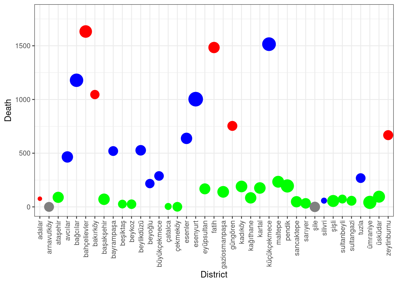
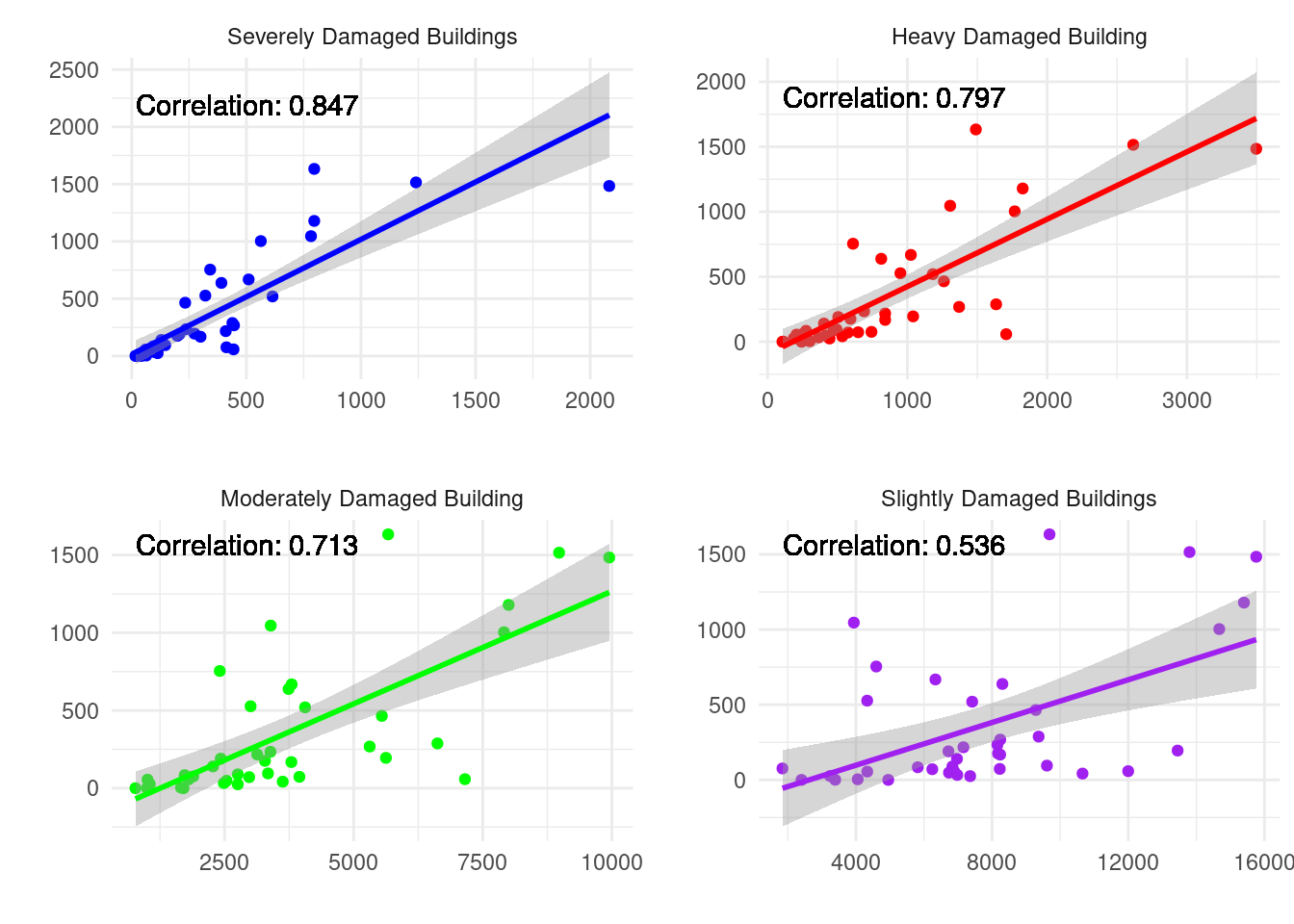
    district_sum <- deprem_analiz %>% group_by(ilce_adi) %>% summarise(
                                                                  total_cok_agir_hasarli = sum(cok_agir_hasarli_bina_sayisi),
                                                                  total_agir_hasarli = sum(agir_hasarli_bina_sayisi),
                                                                  total_orta_hasarli = sum(orta_hasarli_bina_sayisi),
                                                                  total_hafif_hasarli = sum(hafif_hasarli_bina_sayisi),
                                                                  total_can_kaybi = sum(can_kaybi_sayisi),
                                                                  total_agir_yarali = sum(agir_yarali_sayisi),
                                                                  total_hafif_yarali = sum(hafif_yarali_sayisi),
                                                                  .groups = 'drop')
    
district_sum <- data.frame(district_sum)

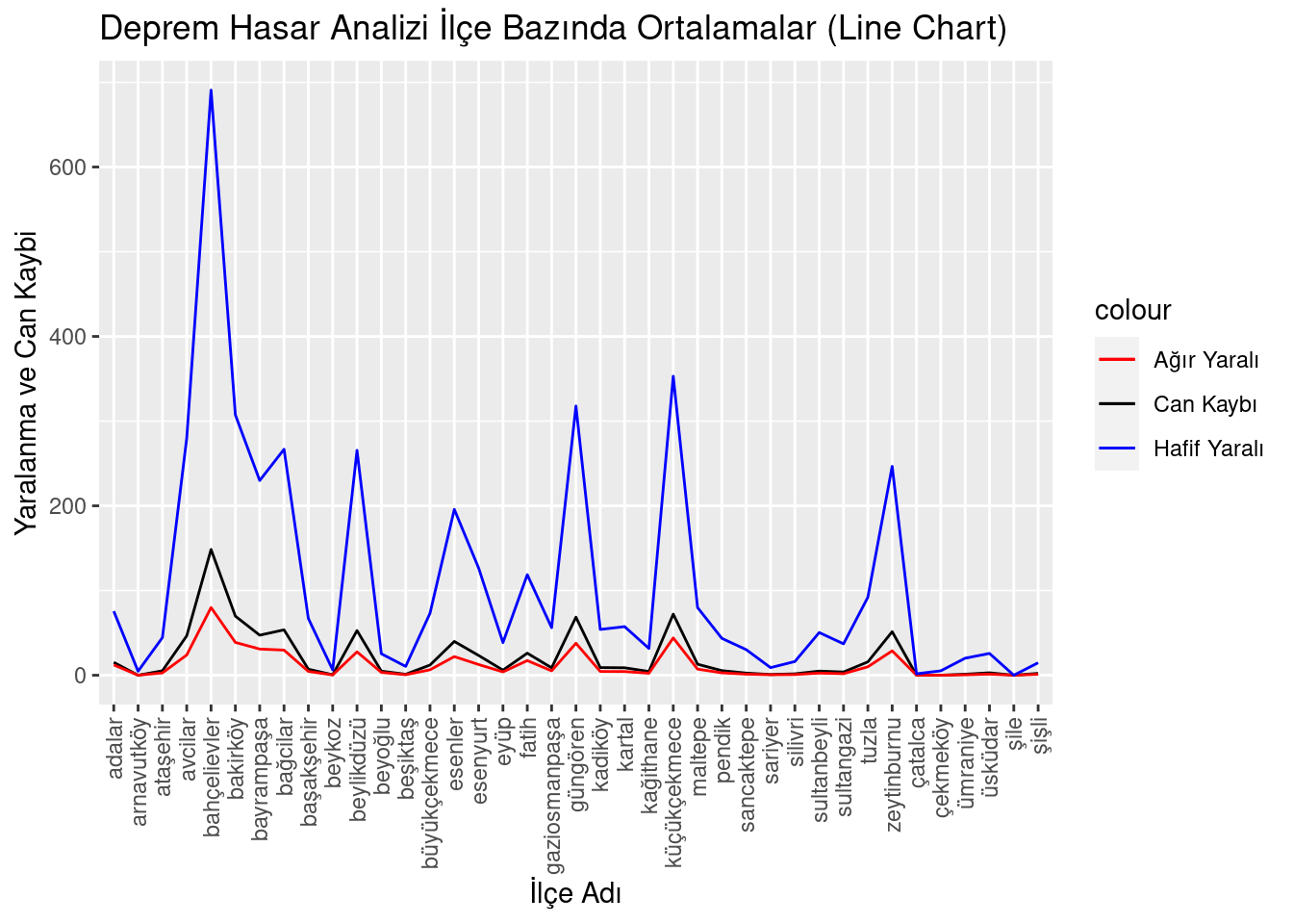
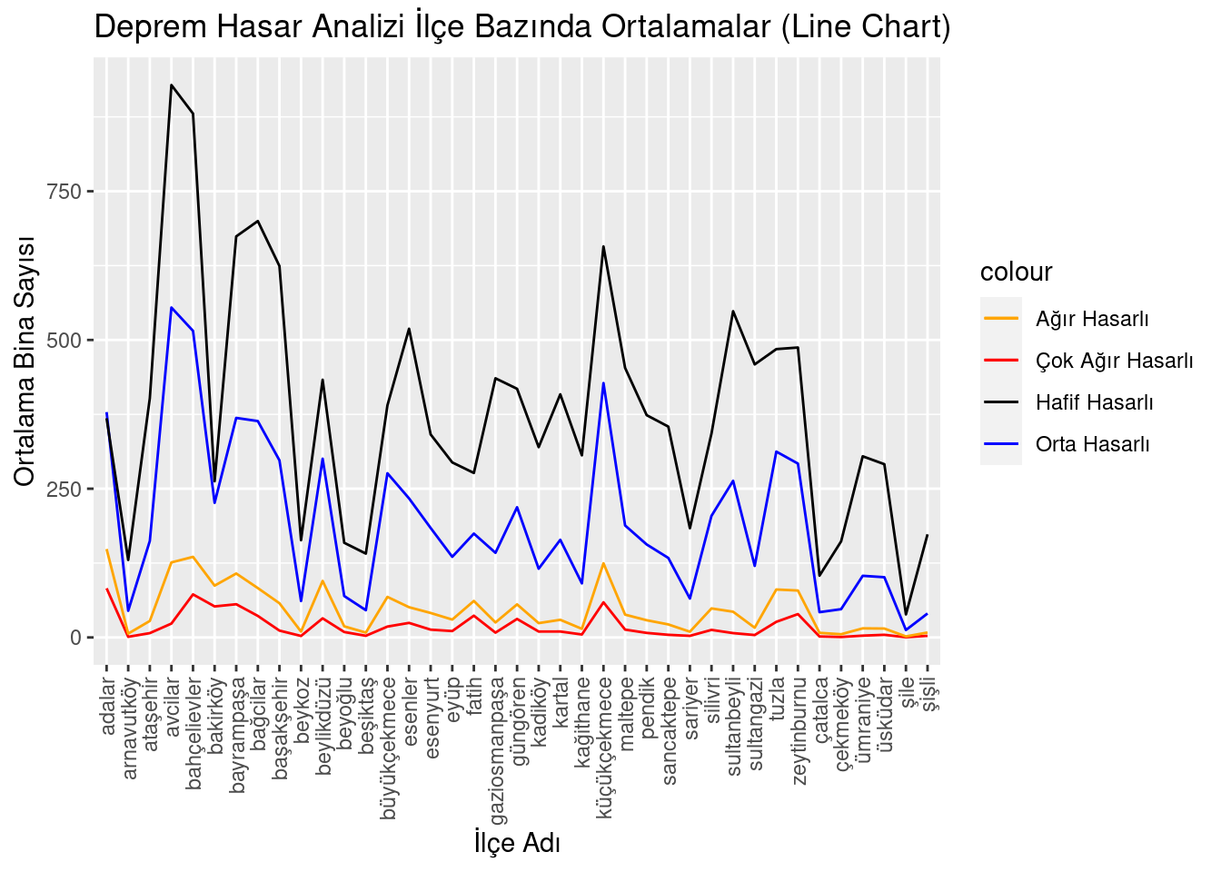
    district_avg <- deprem_analiz %>% group_by(ilce_adi) %>% summarise(
                                                                  avg_cok_agir_hasarli = mean(cok_agir_hasarli_bina_sayisi),
                                                                  avg_agir_hasarli = mean(agir_hasarli_bina_sayisi),
                                                                  avg_orta_hasarli = mean(orta_hasarli_bina_sayisi),
                                                                  avg_hafif_hasarli = mean(hafif_hasarli_bina_sayisi),
                                                                  avg_can_kaybi = mean(can_kaybi_sayisi),
                                                                  avg_agir_yarali = mean(agir_yarali_sayisi),
                                                                  avg_hafif_yarali = mean(hafif_yarali_sayisi),
                                                                 .groups = 'drop')
    district_avg$ilce_adi <- factor(district_avg$ilce_adi, levels = unique(district_avg$ilce_adi))
    
    kable(head(district_avg, 10), caption="Data")
Data
ilce_adi avg_cok_agir_hasarli avg_agir_hasarli avg_orta_hasarli avg_hafif_hasarli avg_can_kaybi avg_agir_yarali avg_hafif_yarali
adalar 82.600000 148.600000 378.80000 368.4000 15.2000000 12.2000000 75.600000
arnavutköy 1.078947 6.394737 44.84211 130.2632 0.0000000 0.0000000 4.710526
ataşehir 7.235294 27.705882 162.11765 401.9412 5.2352941 2.7647059 44.411765
avcilar 23.300000 126.100000 554.50000 928.5000 46.5000000 23.9000000 279.900000
bahçelievler 72.363636 135.454545 515.27273 880.5455 148.4545455 79.9090909 690.818182
bakirköy 52.133333 87.066667 226.26667 262.6000 69.7333333 38.7333333 307.333333
bayrampaşa 55.818182 107.454545 369.00000 674.0909 47.2727273 30.9090909 229.909091
bağcilar 36.181818 82.954545 363.68182 699.8636 53.5909091 29.6363636 266.772727
başakşehir 11.500000 57.500000 297.70000 624.3000 7.1000000 4.5000000 67.000000
beykoz 2.511111 9.844444 61.24444 163.4667 0.5555556 0.3555556 6.311111
Show the code
    building_avg_line <- ggplot(district_avg, aes(x = ilce_adi)) +
                geom_line(aes(y = avg_cok_agir_hasarli, group = 1, color = "Çok Ağır Hasarlı")) +
                geom_line(aes(y = avg_agir_hasarli, group = 1, color = "Ağır Hasarlı")) +
                geom_line(aes(y = avg_orta_hasarli, group = 1, color = "Orta Hasarlı")) +
                geom_line(aes(y = avg_hafif_hasarli, group = 1, color = "Hafif Hasarlı")) +
                ylab("Ortalama Bina Sayısı") +
                xlab("İlçe Adı") +
                ggtitle("Deprem Hasar Analizi İlçe Bazında Ortalamalar (Line Chart)") +
                theme(axis.text.x = element_text(angle = 90, vjust = 0.5, hjust=1)) +
                scale_color_manual(values = c("Çok Ağır Hasarlı" = "red", "Ağır Hasarlı" = "orange", 
                                              "Orta Hasarlı" = "blue", "Hafif Hasarlı" = "black"))
  
    building_avg_bar <- ggplot(district_avg, aes(x = ilce_adi)) +
                geom_bar(aes(y = avg_hafif_hasarli), fill = "black", position = "dodge", stat = "identity") +
                geom_bar(aes(y = avg_orta_hasarli), fill = "blue", position = "dodge", stat = "identity") +
                geom_bar(aes(y = avg_agir_hasarli), fill = "orange", position = "dodge", stat = "identity") +
                geom_bar(aes(y = avg_cok_agir_hasarli), fill = "red", position = "dodge", stat = "identity") +
                ylab("Ortalama Bina Sayısı") +
                xlab("İlçe Adı") +
                ggtitle("Deprem Hasar Analizi İlçe Bazında Ortalamalar")+
                theme(axis.text.x = element_text(angle = 90, vjust = 0.5, hjust=1))

    avg_health <- ggplot(district_avg, aes(x = ilce_adi)) +
                geom_line(aes(y = avg_can_kaybi, group = 1, color = "Can Kaybı")) +
                geom_line(aes(y = avg_agir_yarali, group = 1, color = "Ağır Yaralı")) +
                geom_line(aes(y = avg_hafif_yarali, group = 1, color = "Hafif Yaralı")) +
                ylab("Yaralanma ve Can Kaybi") +
                xlab("İlçe Adı") +
                ggtitle("Deprem Hasar Analizi İlçe Bazında Ortalamalar (Line Chart)") +
                theme(axis.text.x = element_text(angle = 90, vjust = 0.5, hjust=1)) +
                scale_color_manual(values = c("Can Kaybı" = "black", "Ağır Yaralı" = "red", 
                                              "Hafif Yaralı" = "blue"))

District Based Averages ❗

Which ‘district’ is More “Safer” 🌎🏘️🏭

Show the code
avg_health

  • Above we are able to see how many people would die or get injured in each district when the disaster comes. Focus on the districts that have the pick values. Do they get the highest value because they are really dangerous, or is it just because they have large population? In the following graphs we will also be focusing on the population.

isTRUE(“Safer” == “Resistant”) ❓

Show the code
  building_avg_line

  • This plot shows us average number of buildings and classification of damaged buildings for each district. It looks similar to previous plot. So, there might be a correlation between deaths and damaged building number.

  • Later you will also see this correlation levels.

Danger Zone 🆘

Show the code
    danger_level <- as.numeric(istanbul_df$can_kaybi_sayisi/istanbul_df$X2019.yılı.nüfusları * 1000)
    istanbul_coordinates$danger_level <- as.numeric(format(danger_level, scientific = FALSE))
    istanbul_coordinates <- istanbul_coordinates[order(istanbul_coordinates$danger_level, decreasing = TRUE),]
    
    istanbul_coordinates$color <- ifelse(istanbul_coordinates$danger_level > 2, "red",
                                         ifelse(istanbul_coordinates$danger_level > 0.75, "blue", "green"))
    istanbul_coordinates$danger_level <- format(istanbul_coordinates$danger_level, scientific = FALSE)
    
    kable(head(istanbul_coordinates, 10), caption = "istanbul something.")
istanbul something.
ilceler latitude longitude danger_level color
1 adalar 40.86780 29.13310 4.987531172 red
7 bakırköy 40.98064 28.86287 4.562923412 red
20 fatih 41.01446 28.95455 3.349206707 red
6 bahçelievler 41.00029 28.86375 2.672409702 red
22 güngören 41.01981 28.87484 2.605021403 red
39 zeytinburnu 41.00562 28.90820 2.275405860 red
26 küçükçekmece 40.99600 28.77480 1.910897920 blue
9 bayrampaşa 41.05125 28.89847 1.892732997 blue
5 bağcılar 41.04473 28.83371 1.582284852 blue
31 silivri 41.07390 28.24640 1.538788072 blue
  • Here, we are able to see the danger zones which are determined by the ratio death/population for each district. Also, each district is assigned one of the following classification if they fall into related threshold values. High Dangerous colored by red, Medium Dangerous colored by blue and Least Dangerous colored by green.

Loss of Life 👥 / Population 🧑‍🤝‍🧑👨‍👨‍👧‍👧

Show the code
    istanbul_df %>%
  select(ilce_adi, X2019.yılı.nüfusları, can_kaybi_sayisi) %>%
  ggplot(aes(x = ilce_adi, y = can_kaybi_sayisi)) +
  geom_point(aes(size = X2019.yılı.nüfusları, color = cut(((can_kaybi_sayisi / X2019.yılı.nüfusları) * 1000), 
                                                          breaks = c(0, 0.7, 2, 5), 
                                                          labels = c("Least Dangerous", "Medium Dangerous", "High Dangerous")))) +
  scale_color_manual(values = c("High Dangerous" = "red", "Medium Dangerous" = "blue", "Least Dangerous" = "green"))+
  theme_bw()+
  theme(axis.text.x = element_text(angle = 90, vjust = 0.5, hjust = 1), legend.position = "none") +
  xlab("District") +
  ylab("Death") +
  scale_y_continuous(limits = c(0, max(istanbul_df$can_kaybi_sayisi) * 1.1)) +
  scale_size_continuous(range=c(2,8))

  • Area of the points show us the population size of the district and colors are the danger levels of each district based on the threshold levels determined.

  • So, here instead of only taking deaths into account, we are able to see relation of death with population. If deaths are high even if population is relatively small than others, we can say that this district is high dangerous zone. If the population is large, and deaths are relatively small, we can assume that this zone is safer than others. Finally, this relations are differs by colors.

Danger Zone map 🗺️

Show the code
    harita <- leaflet(istanbul_coordinates) %>%
      addTiles() %>%
      addCircleMarkers(
        lng = ~longitude,
        lat = ~latitude,
        radius = istanbul_df$X2019.yılı.nüfusları/50000,
        color = ~color,
        fillOpacity = 0.65,
        popup = ~paste(ilceler, ": ", danger_level)
      )

    harita
  • Now, you can see what we have done so far on the real map. Focus on colors and size of the nodes. Here we can see that south part of the İstanbul is going to get the highest damage. Hence, we do not recommend you to be in İstanbul unless there is an urgency. And if you do, stay away from the south and try to be around the green nodes.

Loss of Life Rates 🚩

by Damage Level of Buildings

Show the code
    cor_func <- function(x, y) {
  cor_coef <- cor(x, y)
  cor_label <- paste("Correlation:", round(cor_coef, 3))
  return(cor_label)
}

plot1 <- ggplot(istanbul_df, aes(x = cok_agir_hasarli_bina_sayisi)) +
  geom_point(aes(y = can_kaybi_sayisi), color = "blue") +
  geom_smooth(aes(y = can_kaybi_sayisi), method = "lm", se = TRUE, color = "blue") +
  geom_text(aes(x = min(cok_agir_hasarli_bina_sayisi), y = max(can_kaybi_sayisi), label = cor_func(can_kaybi_sayisi, cok_agir_hasarli_bina_sayisi)), 
            hjust = 0, vjust = -2.5, color = "black") +
  theme_minimal() +
  facet_wrap(~"Severely Damaged Buildings", scales = "free") +
  ylab("") + xlab("")

plot2 <- ggplot(istanbul_df, aes(x = agir_hasarli_bina_sayisi)) +
  geom_point(aes(y = can_kaybi_sayisi), color = "red") +
  geom_smooth(aes(y = can_kaybi_sayisi), method = "lm", se = TRUE, color = "red") +
  geom_text(aes(x = min(agir_hasarli_bina_sayisi), y = max(can_kaybi_sayisi), label = cor_func(can_kaybi_sayisi, agir_hasarli_bina_sayisi)), 
            hjust = 0, vjust = -1, color = "black") +
  theme_minimal() +
  facet_wrap(~"Heavy Damaged Building", scales = "free") +
  ylab("") + xlab("")

plot3 <- ggplot(istanbul_df, aes(x = orta_hasarli_bina_sayisi)) +
  geom_point(aes(y = can_kaybi_sayisi), color = "green") +
  geom_smooth(aes(y = can_kaybi_sayisi), method = "lm", se = TRUE, color = "green") +
  geom_text(aes(x = min(orta_hasarli_bina_sayisi), y = max(can_kaybi_sayisi), label = cor_func(can_kaybi_sayisi, orta_hasarli_bina_sayisi)), 
            hjust = 0, vjust = 1, color = "black") +
  theme_minimal() +
  facet_wrap(~"Moderately Damaged Building", scales = "free") +
  ylab("") + xlab("")

plot4 <- ggplot(istanbul_df, aes(x = hafif_hasarli_bina_sayisi)) +
  geom_point(aes(y = can_kaybi_sayisi), color = "purple") +
  geom_smooth(aes(y = can_kaybi_sayisi), method = "lm", se = TRUE, color = "purple") +
  geom_text(aes(x = min(hafif_hasarli_bina_sayisi), y = max(can_kaybi_sayisi), label = cor_func(can_kaybi_sayisi, hafif_hasarli_bina_sayisi)), 
            hjust = 0, vjust = 1, color = "black") +
  theme_minimal() +
  facet_wrap(~"Slightly Damaged Buildings", scales = "free") +
  ylab("") + xlab("")

grid.arrange(plot1, plot2, plot3, plot4,ncol=2)

  • We also mentioned that average health and average building plots look similar. Nearly around each district we see the pick values. So, we decided to look for the correlation levels of these two variables.

    Here our dependent variable is deaths and independent variables are types of damaged buildings. Correlation levels can also been. Here we can understand the relation between damaged building and deaths.

by Age of Buildings 🧓🏼🏡

Show the code
    cor_func <- function(x, y) {
  cor_coef <- cor(x, y)
  cor_label <- paste("Correlation:", round(cor_coef, 3))
  return(cor_label)
}

bina_yası_plot1 <- ggplot(istanbul_df, aes(x = once_1980)) +
  geom_point(aes(y = can_kaybi_sayisi), color = "blue") +
  geom_smooth(aes(y = can_kaybi_sayisi), method = "lm", se = TRUE, color = "blue") +
  geom_text(aes(x = min(once_1980), y = max(can_kaybi_sayisi), label = cor_func(can_kaybi_sayisi, once_1980)), 
            hjust = 0, vjust = 1, color = "black") +
  theme_minimal() +
  facet_wrap(~"Buildings Before 1980", scales = "free") +
  ylab("") + xlab("")

bina_yası_plot2 <- ggplot(istanbul_df, aes(x = ara_1980_2000)) +
  geom_point(aes(y = can_kaybi_sayisi), color = "red") +
  geom_smooth(aes(y = can_kaybi_sayisi), method = "lm", se = TRUE, color = "red") +
  geom_text(aes(x = min(ara_1980_2000), y = max(can_kaybi_sayisi), label = cor_func(can_kaybi_sayisi, ara_1980_2000)), 
            hjust = 0, vjust = 1, color = "black") +
  theme_minimal() +
  facet_wrap(~"Buildings Between 1980-2000", scales = "free") +
  ylab("") + xlab("")

bina_yası_plot3 <- ggplot(istanbul_df, aes(x = sonra_2000)) +
  geom_point(aes(y = can_kaybi_sayisi), color = "green") +
  geom_smooth(aes(y = can_kaybi_sayisi), method = "lm", se = TRUE, color = "green") +
  geom_text(aes(x = min(sonra_2000), y = max(can_kaybi_sayisi), label = cor_func(can_kaybi_sayisi, sonra_2000)), 
            hjust = 0, vjust = 1, color = "black") +
  theme_minimal() +
  facet_wrap(~"Buildings After 2000", scales = "free") +
  ylab("") + xlab("")

grid.arrange(bina_yası_plot1, bina_yası_plot2, bina_yası_plot3, ncol = 2)

  • In the above plots we are able to see correlations between ages of buildings and loss of life.

  • Recognize that buildings constructed before 1980 have the highest correlation level. That means, old constructions have bigger impact on the loss of lives. When constructions get newer correlation levels decreasing. Hence, we can understand that latest constructions are safer than the previous ones.

by Storeys of the Buildings 😅

Show the code
    cor_func <- function(x, y) {
  cor_coef <- cor(x, y)
  cor_label <- paste("Correlation:", round(cor_coef, 3))
  return(cor_label)
}

kat_sayisi_plot1 <- ggplot(istanbul_df, aes(x = ara_1_4_kat)) +
  geom_point(aes(y = can_kaybi_sayisi), color = "blue") +
  geom_smooth(aes(y = can_kaybi_sayisi), method = "lm", se = TRUE, color = "blue") +
  geom_text(aes(x = min(ara_1_4_kat), y = max(can_kaybi_sayisi), label = cor_func(can_kaybi_sayisi, ara_1_4_kat)), 
            hjust = 0, vjust = 1, color = "black") +
  theme_minimal() +
  facet_wrap(~"Buildings with 1 to 4 Storeys", scales = "free") +
  ylab("") + xlab("")

kat_sayisi_plot2 <- ggplot(istanbul_df, aes(x = ara_5_9_kat)) +
  geom_point(aes(y = can_kaybi_sayisi), color = "red") +
  geom_smooth(aes(y = can_kaybi_sayisi), method = "lm", se = TRUE, color = "red") +
  geom_text(aes(x = min(ara_5_9_kat), y = max(can_kaybi_sayisi), label = cor_func(can_kaybi_sayisi, ara_5_9_kat)), 
            hjust = 0, vjust = 1, color = "black") +
  theme_minimal() +
  facet_wrap(~"Buildings with 5 to 9 Storeys", scales = "free") +
  ylab("") + xlab("")

kat_sayisi_plot3 <- ggplot(istanbul_df, aes(x = ara_9_19_kat)) +
  geom_point(aes(y = can_kaybi_sayisi), color = "green") +
  geom_smooth(aes(y = can_kaybi_sayisi), method = "lm", se = TRUE, color = "green") +
  geom_text(aes(x = min(ara_9_19_kat), y = max(can_kaybi_sayisi), label = cor_func(can_kaybi_sayisi, ara_9_19_kat)), 
            hjust = 0, vjust = 1, color = "black") +
  theme_minimal() +
  facet_wrap(~"Buildings with 9 to 19 Storeys", scales = "free") +
  ylab("") + xlab("")

grid.arrange(kat_sayisi_plot1, kat_sayisi_plot2, kat_sayisi_plot3, ncol = 2)

  • We also applied same approach to building storeys.

  • Here we understand that buildings with 1 to 4 storeys are much safer than the buildings with 5 to 9 storeys since they have negative correlation with loss of life.

  • Also, when we look at the correlation plot for buildings with 9 and above storeys, they also look safe. However, this result might be biased due to lack of information on these buildings.

What Should Be Done ❓

Regression Analysis ❗🌎📍⚙️📓✅🎉

  • Finally, we put our data into regression model to see which variable have importance on loss of live. As you guess, our dependent variable is loss of life. All other variables such as storey informations, age information etc. are our independent variables.

  • The model itself returns us which of the variables are more significant on the dependent varaibles. Model indicates these variables with *** at the end of the row. These are significant according to model because their p values are less than 0.05.

  • Estimate values are describe how much dependent variable change when 1 unit increase occur on related independent variables.

  • For instance, if severely damaged building increases by one, about 43 more people would also die. Interestengly, waste water pipe damages are also significant for the model and influence the loss of life. 1 unit of pipe damage increases the number of people died by 6.

Show the code
dependent_variable <- reg_df$can_kaybi_sayisi
independent_variables <- reg_df[, c(
  "cok_agir_hasarli_bina_sayisi",
  "agir_hasarli_bina_sayisi",
  "orta_hasarli_bina_sayisi",
  "hafif_hasarli_bina_sayisi",
  "dogalgaz_boru_hasari",
  "icme_suyu_boru_hasari",
  "atik_su_boru_hasari",
  "once_1980",
  "ara_1980_2000",
  "sonra_2000",
  "ara_1_4_kat",
  "ara_5_9_kat",
  "ara_9_19_kat"
)]

standardize <- function(x) {
  return((x - mean(x)) / sd(x))
}

scaled_independent_variables <- as.data.frame(lapply(independent_variables, standardize))

scaled_regression_model <- lm(dependent_variable ~ ., data = scaled_independent_variables)

summary(scaled_regression_model)

Call:
lm(formula = dependent_variable ~ ., data = scaled_independent_variables)

Residuals:
    Min      1Q  Median      3Q     Max 
-55.137  -4.937  -0.133   3.729  80.867 

Coefficients: (1 not defined because of singularities)
                             Estimate Std. Error t value Pr(>|t|)    
(Intercept)                   14.7497     0.3723  39.619  < 2e-16 ***
cok_agir_hasarli_bina_sayisi  42.8283     1.9148  22.367  < 2e-16 ***
agir_hasarli_bina_sayisi     -60.5864     4.6481 -13.035  < 2e-16 ***
orta_hasarli_bina_sayisi      48.3867     5.6024   8.637  < 2e-16 ***
hafif_hasarli_bina_sayisi     -7.3059     4.1575  -1.757 0.079191 .  
dogalgaz_boru_hasari           0.8949     0.7459   1.200 0.230507    
icme_suyu_boru_hasari          0.5104     0.8291   0.616 0.538297    
atik_su_boru_hasari            6.4169     0.8359   7.676 4.07e-14 ***
once_1980                      1.2912     2.0357   0.634 0.526049    
ara_1980_2000                  6.1606     3.5634   1.729 0.084161 .  
sonra_2000                     2.4245     2.4252   1.000 0.317712    
ara_1_4_kat                  -14.8254     4.2357  -3.500 0.000487 ***
ara_5_9_kat                   -1.7927     2.3339  -0.768 0.442619    
ara_9_19_kat                       NA         NA      NA       NA    
---
Signif. codes:  0 '***' 0.001 '**' 0.01 '*' 0.05 '.' 0.1 ' ' 1

Residual standard error: 11.53 on 946 degrees of freedom
Multiple R-squared:  0.8422,    Adjusted R-squared:  0.8402 
F-statistic: 420.7 on 12 and 946 DF,  p-value: < 2.2e-16
Back to top