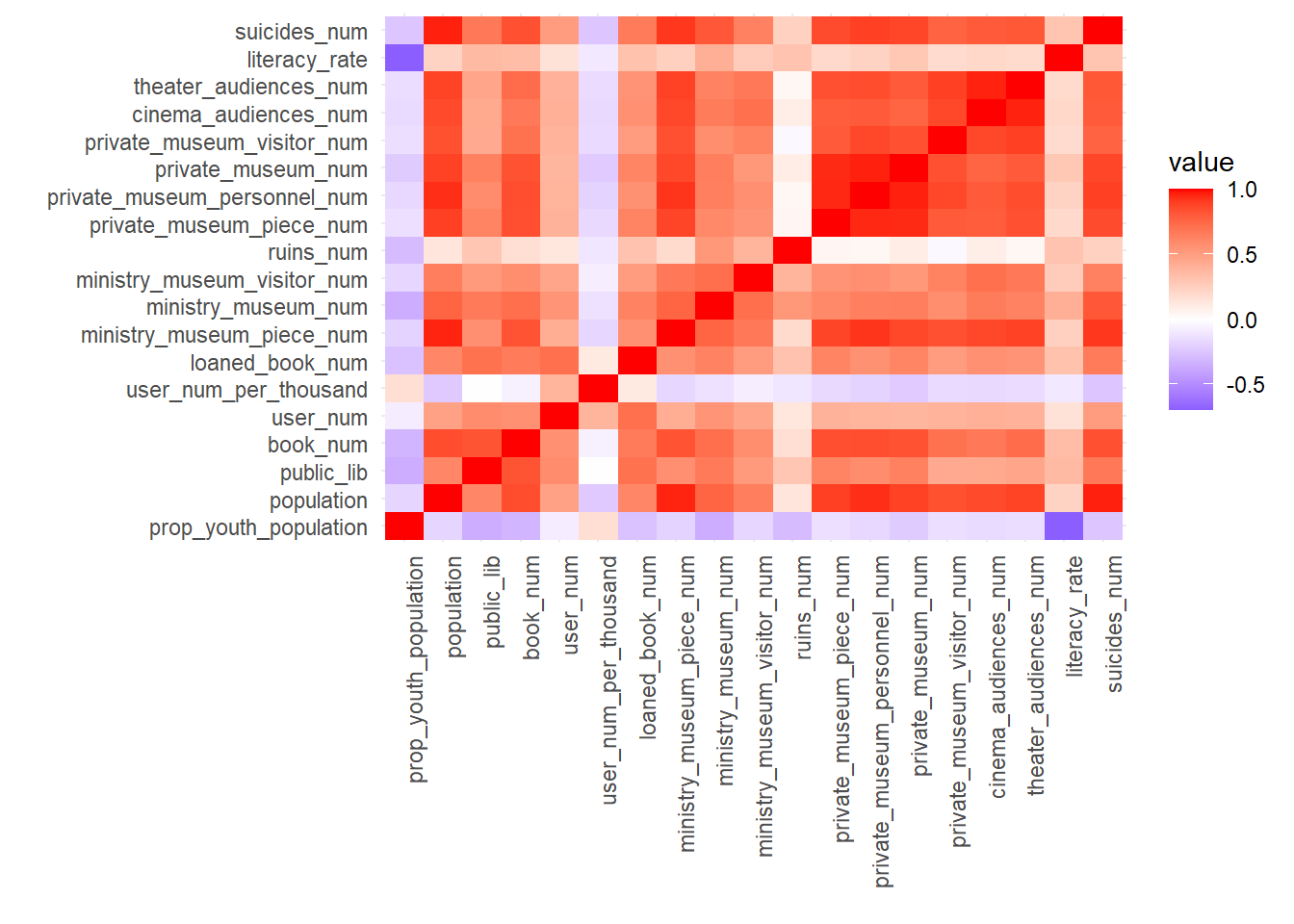
There appears to be a positive correlation among several variables. In cities with larger populations, there tends to be a higher number of museums, libraries, as well as greater audience numbers for theaters and cinemas, alongside an increase in suicide rates. Additionally, it’s observed that when a museum has a large collection, the number of museums, libraries, and the audiences for theaters and cinemas in that area are also typically higher. However, there is a notable inverse relationship between the percentage of the young population and the literacy rate.
Despite population size often correlating with cultural resources, the data for 2022 unveils intriguing deviations. While larger cities like Istanbul, Ankara, Izmir, and Antalya typically showcase lower rankings in metrics like books per capita and library sizes, smaller cities like Bayburt remarkably lead in these aspects. Moreover, the strikingly high user count-to-population ratio in smaller cities, exemplified by Batman’s library usage statistics, challenges the expected norms, suggesting a higher propensity for library engagement in smaller urban centers.
While there are pronounced regional disparities in the number of borrowed books, the count of museum visitors exhibits a more consistent trend across regions. Additionally, fluctuations in library usage rates from 2019 to 2022 and regional preferences stand out prominently.
Graph (5.1), the very high correlation (0.9982) between population growth and cinema audience numbers, especially in densely populated areas of big cities, can be explained by the abundance and accessibility of movie theaters. Graph (5.2), although there is a high correlation (0.9711) between literacy rates and suicide rates, the reasons for this relationship may be complex and may not imply a direct cause-and-effect connection.
correlation_matrix <-cor(library_museum_updated[, c(3:21)], use ="complete.obs")melted_corr_matrix <-melt(correlation_matrix)ggplot(melted_corr_matrix, aes(Var1, Var2, fill = value)) +geom_tile() +labs(x =" ", y =" ") +guides(color =guide_legend(title ="Value"))+scale_fill_gradient2(low ="blue", high ="red", mid ="white", midpoint =0) +theme_minimal() +theme(axis.text.x =element_text(angle =90, hjust =1))
In the areas where the squares are dark red, there is a positive correlation between the variables. In cities with a high population, the number of museums, libraries, theater and cinema audience numbers, and the number of suicides are also high. Conversely, when the number of pieces in a museum is high, it is observed that the number of museums, libraries, audience numbers of theaters and cinemas are also high. The variables intersecting in dark blue-purple squares, on the other hand, have a negative correlation. That is, there is an inverse relationship between the proportion of the young population and the literacy rate.
2) Relationship Between Attributes
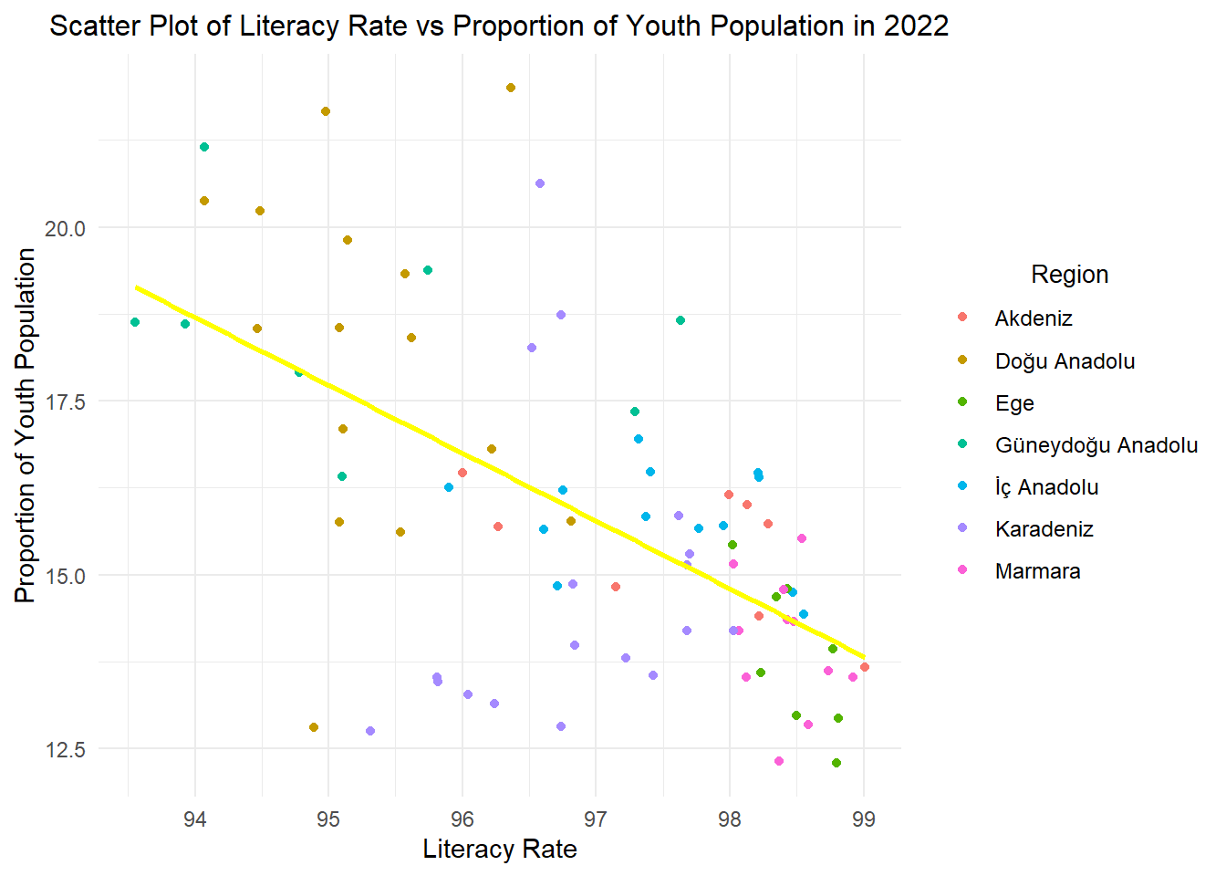
2.1) Literacy Rate vs. Proportion of Youth Population
Show the code
cor_pop_book_2 <-cor(data$literacy_rate, data$prop_youth_population)cat("Correlation between Literacy Rate and Proportion of Youth Population:",cor_pop_book_2,"\n")
Correlation between Literacy Rate and Proportion of Youth Population: -0.6908264
The correlation of - 0.69 indicates a negative relationship between literacy rate and proportion of youth population. This situation may be due to the number of children in the preschool age group.
Show the code
data|>filter(year==2022)|>ggplot(aes(x = literacy_rate, y = prop_youth_population, color = region)) +geom_point() +geom_smooth(method ="lm", se =FALSE, color ="yellow", formula = y ~ x)+labs(x ="Literacy Rate", y ="Proportion of Youth Population") +ggtitle("Scatter Plot of Literacy Rate vs Proportion of Youth Population in 2022") +guides(color =guide_legend(title ="Region")) +theme_minimal() +theme(plot.title =element_text(size =12, hjust =0.5),legend.text =element_text(size =9), legend.title =element_text(size =10,hjust =0.5))
This plot shows an inverse relationship between two attributes. Cities in the Marmara region have a high literacy rate and a low youth population, while the situation is the opposite for cities in the Doğu Anadolu region. This may reflect the impact of socio-economic differences between the Marmara and Doğu Anadolu regions, as well as the effect of children entering the workforce at an early age.
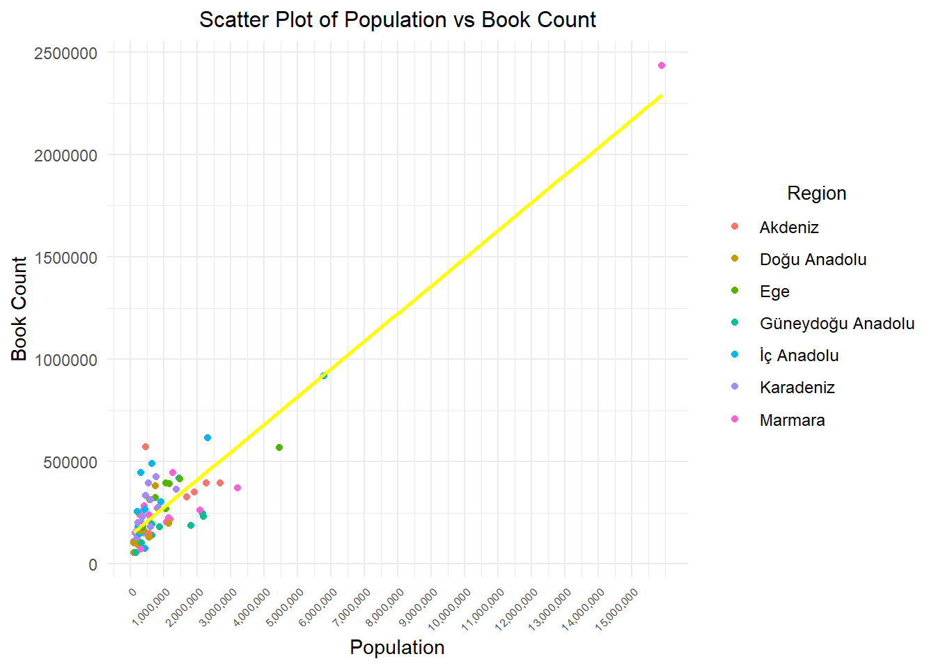
2.2) Population vs. Number of Books
Show the code
cor_pop_book <-cor(data$population, data$book_num)cat("Correlation between Population and Number of Books:",cor_pop_book,"\n")
Correlation between Population and Number of Books: 0.8517451
The correlation of 0.8455922 indicates a strong positive relationship between population and the number of books. In other words, as the population of cities generally increases, there is a tendency for the number of books in libraries to increase as well. Let’s try to support this with visualizations.
Show the code
data|>filter(year==2022) |>ggplot( aes(x = population, y = book_num,color = region)) +geom_point() +geom_smooth(method ="lm", se =FALSE, color ="yellow", formula = y ~ x)+labs(x ="Population", y ="Book Count") +ggtitle("Scatter Plot of Population vs Book Count") +guides(color =guide_legend(title ="Region"))+theme_minimal() +theme(plot.title =element_text(size =12, hjust =0.5),axis.text.x =element_text(angle =45, hjust =1, size =6),legend.text =element_text(size =9), legend.title =element_text(size =10,hjust =0.5)) +scale_x_continuous(labels = scales::comma, breaks =seq(0, 15000000, by =1000000))
According to the 2022 data from the Turkish Statistical Institute, 97.6% of the cities in Turkey have a population of less than 5 million. As seen in the above graph, the areas where the points are dense correspond to locations with a population of less than 5 million. For this reason, the following plot was created.
Show the code
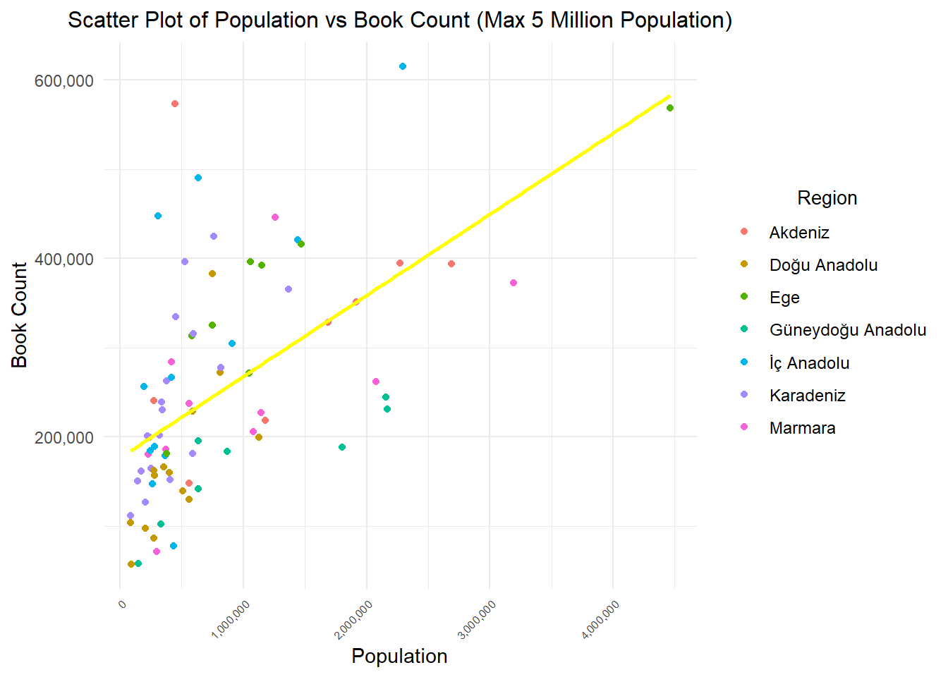
data %>%filter(population <=5000000& year==2022) %>%ggplot(aes(x = population, y = book_num,color = region)) +geom_point() +geom_smooth(method ="lm", se =FALSE, color ="yellow", formula = y ~ x) +labs(x ="Population", y ="Book Count") +ggtitle("Scatter Plot of Population vs Book Count (Max 5 Million Population)") +guides(color =guide_legend(title ="Region"))+theme_minimal() +theme(plot.title =element_text(size =12, hjust =0.5), axis.text.x =element_text(angle =45, hjust =1, size =6),legend.text =element_text(size =9), legend.title =element_text(size =10,hjust =0.5)) +scale_x_continuous(labels = scales::comma, breaks =seq(0, 5000000, by =1000000))+scale_y_continuous(labels = scales::comma)
We supported the correlation results with visualizations. We can say that there is a tendency for the number of books in libraries to increase as the population in cities generally increases. When we look at it regionally, we can clearly see that the cities in the Eastern Anatolia region are visibly below the trend.
2.3) City Comparison
Show the code
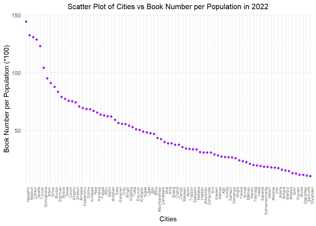
data %>%filter(year ==2022) %>%mutate(book_per_person=book_num/population,city =factor(city, levels =unique(city[order(book_per_person, decreasing =TRUE)]))) %>%ggplot(aes(x = city, y = book_per_person *100)) +geom_point(color ="purple") +geom_smooth(method ="lm", se =FALSE, color ="yellow", formula = y ~ x) +labs(x ="Cities", y ="Book Number per Population (*100)") +ggtitle("Scatter Plot of Cities vs Book Number per Population in 2022") +theme_minimal() +theme(plot.title =element_text(size =12, hjust =0.5), axis.text.x =element_text(angle =90, hjust =1, size =6))
We looked into the number of books per capita in the population of each city, as we believed it would provide a more meaningful insight in this graph. The book count on the Y-axis was multiplied by 100. The graph is based on data from the year 2022. According to the results, surprisingly, Nevşehir and Bayburt appear to be leading cities in this aspect. Cities with high populations and diverse demographics, such as Istanbul, Ankara, Izmir, and Antalya, are at the bottom of the list. For now, let’s keep Bayburt in mind from this graph :)
Show the code
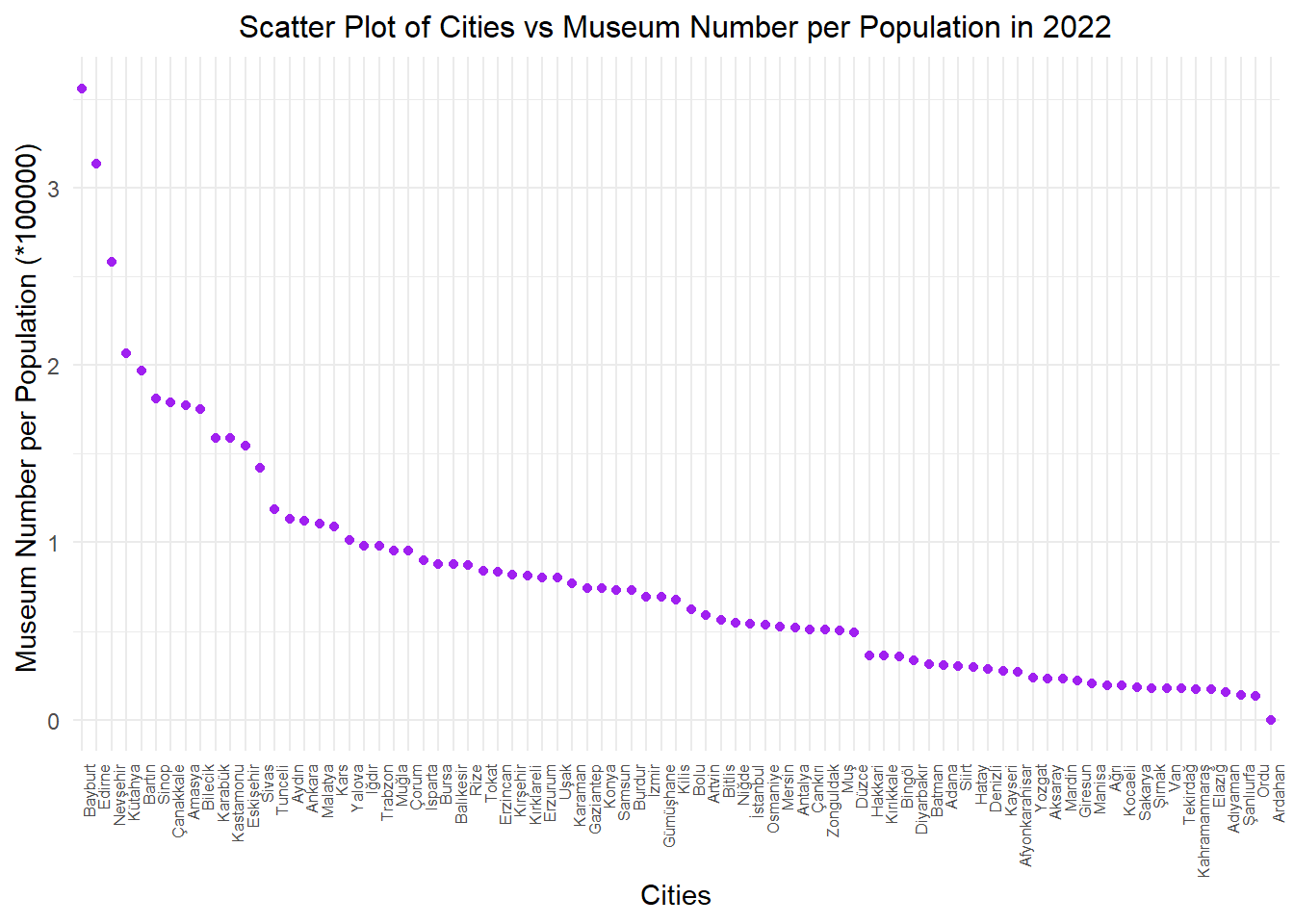
data %>%filter(year ==2022) %>%mutate(museum_per_person=((ministry_museum_num + private_museum_num)/population), city =factor(city, levels =unique(city[order(museum_per_person, decreasing =TRUE)]))) %>%ggplot(aes(x = city, y = museum_per_person *100000)) +geom_point(color ="purple") +geom_smooth(method ="lm", se =FALSE, color ="yellow", formula = y ~ x) +labs(x ="Cities", y ="Museum Number per Population (*100000) ") +ggtitle("Scatter Plot of Cities vs Museum Number per Population in 2022") +theme_minimal() +theme(plot.title =element_text(size =12, hjust =0.5), axis.text.x =element_text(angle =90, hjust =1, size =6))
In this graph, you can see the ratio of the combined number of ministry and private museums to the population of each city. The Y-axis has been multiplied by 100,000 for meaningful representation, showing the number of museums per 100,000 people.The graph is based on data from the year 2022. While Doğu and Güney Doğu cities are at the bottom of the list, once again, Bayburt leads the chart.
Show the code
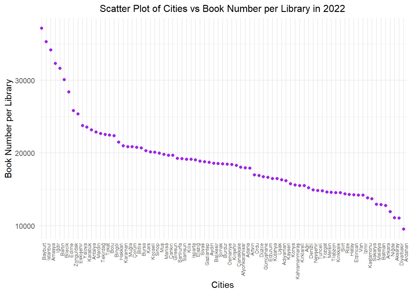
data %>%filter(year ==2022) %>%mutate(book_num_per_lib=(book_num/public_lib), city =factor(city, levels =unique(city[order(book_num_per_lib, decreasing =TRUE)]))) %>%ggplot(aes(x = city, y = book_num_per_lib )) +geom_point(color ="purple") +geom_smooth(method ="lm", se =FALSE, color ="yellow", formula = y ~ x) +labs(x ="Cities", y ="Book Number per Library") +ggtitle("Scatter Plot of Cities vs Book Number per Library in 2022") +theme_minimal() +theme(plot.title =element_text(size =12, hjust =0.5), axis.text.x =element_text(angle =90, hjust=1,size=6))
At this point, we aimed to examine the ratio of library sizes among cities by looking at the proportion of the number of books in a city to the number of libraries. The graph is based on data from the year 2022. The difference between Istanbul and Ankara is quite striking. There’s nearly a threefold difference in library sizes between Turkey’s two most populous cities. The leading city remains unchanged at the top position in this aspect as well.
Show the code
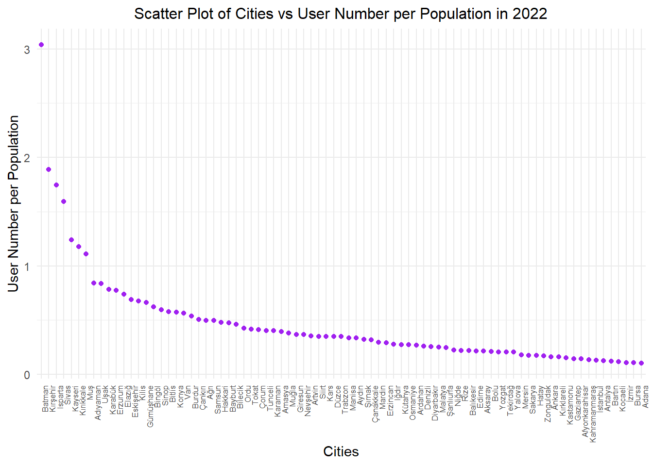
data %>%filter(year ==2022) %>%mutate(user_num_per_pop=(user_num/population), city =factor(city, levels =unique(city[order(user_num_per_pop, decreasing =TRUE)]))) %>%ggplot(aes(x = city, y = user_num_per_pop )) +geom_point(color ="purple") +geom_smooth(method ="lm", se =FALSE, color ="yellow", formula = y ~ x) +labs(x ="Cities", y ="User Number per Population") +ggtitle("Scatter Plot of Cities vs User Number per Population in 2022") +theme_minimal() +theme(plot.title =element_text(size =12, hjust =0.5), axis.text.x =element_text(angle =90, hjust=1,size=6))
It’s time for Bayburt’s leadership to change now, as we’ve reached the statistics on library user counts :) The graph is based on data from the year 2022. What’s remarkable here is the higher user count-to-population ratio is occured in smaller cities. In the top position, Batman stands out, having a library usage statistic nearly three times its population. We’ve considered the possibility of potential inaccuracies in the records. Once again, our highly populated cities form the bottom of the list. Another noteworthy point is Ankara’s user count ratio being ahead of Istanbul.
2.4) Library User Number and Population Change Over Time
To observe the change in library user number in the cities with the highest population growth between 2015 and 2022, we start by identifying the six cities where the population has changed the most.
Show the code
population_2015 <- data %>%filter(year==2015) %>%select(city,population)population_2022 <- data %>%filter(year==2022) %>%select(city,population)population_change <- data %>%filter(year==2015) %>%select(city) %>%mutate(population_frac = (population_2022$population-population_2015$population)/population_2015$population) %>%arrange(desc(population_frac))kable(head(population_change),caption ="Top 6 Cities in Turkey with the Highest Population Change",col.names =c("City", "Population Fraction"),align =c("c", "c"))
Top 6 Cities in Turkey with the Highest Population Change
City
Population Fraction
Yalova
0.2717663
Tekirdağ
0.2180817
Antalya
0.1745928
Kocaeli
0.1679819
Muğla
0.1532749
Şanlıurfa
0.1467986
Show the code
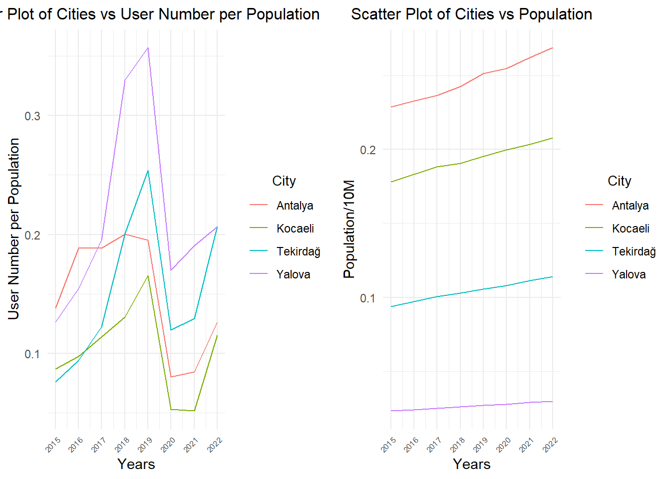
p1 <- data %>%filter(city %in%c("Yalova","Tekirdağ","Antalya","Kocaeli")) %>%mutate(user_num_per_pop=(user_num/population)) %>%ggplot(aes(x = year, y = user_num_per_pop, color = city)) +geom_line() +labs(x ="Years", y ="User Number per Population") +ggtitle("Scatter Plot of Cities vs User Number per Population") +guides(color =guide_legend(title ="City"))+theme_minimal() +theme(plot.title =element_text(size =12, hjust =0.5)) +scale_x_continuous(breaks =seq(min(data$year), max(data$year), by =1)) +theme(plot.title =element_text(size =12, hjust =0.5), axis.text.x =element_text(angle =45, hjust=1,size=6), legend.title =element_text(size =10, hjust =0.5))p2 <- data %>%filter(city %in%c("Yalova","Tekirdağ","Antalya","Kocaeli")) %>%ggplot(aes(x = year, y = population/10000000, color = city)) +geom_line() +labs(x ="Years", y ="Population/10M") +ggtitle("Scatter Plot of Cities vs Population") +guides(color =guide_legend(title ="City")) +theme_minimal() +theme(plot.title =element_text(size =12, hjust =0.5)) +scale_x_continuous(breaks =seq(min(data$year), max(data$year), by =1)) +theme(plot.title =element_text(size =12, hjust =0.5), axis.text.x =element_text(angle =45, hjust=1,size=6),legend.title =element_text(size =10,hjust =0.5))grid.arrange(p1, p2, ncol =2)
In the graph, we can observe that the city with the highest population growth, Yalova, experienced a significant increase in library user numbers between 2015 and 2019. However, in Antalya, despite substantial population growth, there is not a significant increase in library users. Between 2019 and 2021, there is a noticeable decline in library user numbers, influenced by the impact of the pandemic. As of 2022, these numbers seem to be on the rise again.
3) Regional Analysis
3.1) Cinema-Theater Audience Numbers
Show the code
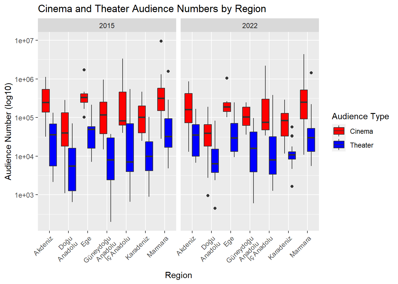
data %>%filter(year %in%c(2022,2015)) %>%pivot_longer(cols =c(cinema_audiences_num, theater_audiences_num), names_to ="Audience_Type", values_to ="Audience_Num") %>%ggplot(aes(x = region, y = Audience_Num, fill = Audience_Type)) +geom_boxplot(position ="dodge") +scale_y_log10() +labs(x ="Region", y ="Audience Number (log10)", fill ="Audience Type") +ggtitle("Cinema and Theater Audience Numbers by Region") +theme(axis.text.x =element_text(angle =45, hjust =1)) +scale_x_discrete(labels =function(x) str_wrap(x, width =10)) +scale_fill_manual(values =c("Red", "Blue"), labels =c("Cinema", "Theater"), name ="Audience Type") +facet_grid(.~year)
In the graph, we can see the distributions of the number of theater and cinema audiences in each region represented on a box plot. In all regions, cinema audiences are higher than theater audiences. Additionally, looking at the years 2015 and 2022, it is observed that there hasn’t been much change in these audience numbers.
3.2) Ministry and Private Museum Visitors
Show the code
data %>%filter(year %in%c(2022,2015)) %>%pivot_longer(cols =c(ministry_museum_visitor_num, private_museum_visitor_num), names_to ="Visitor_Type", values_to ="Visitor_Num") %>%ggplot(aes(x = region, y = Visitor_Num, fill = Visitor_Type)) +geom_boxplot(position ="dodge") +scale_y_log10() +labs(x ="Region", y ="Visitor Number (log10)", fill ="Museum Type") +ggtitle("Ministry and Private Museum Visitor Numbers by Region") +theme(axis.text.x =element_text(angle =45, hjust =1)) +scale_x_discrete(labels =function(x) str_wrap(x, width =10)) +facet_grid(.~year) +scale_fill_manual(values =c("Pink", "Purple"), labels =c("Ministry Museum", "Private Museum"), name ="Museum Type")
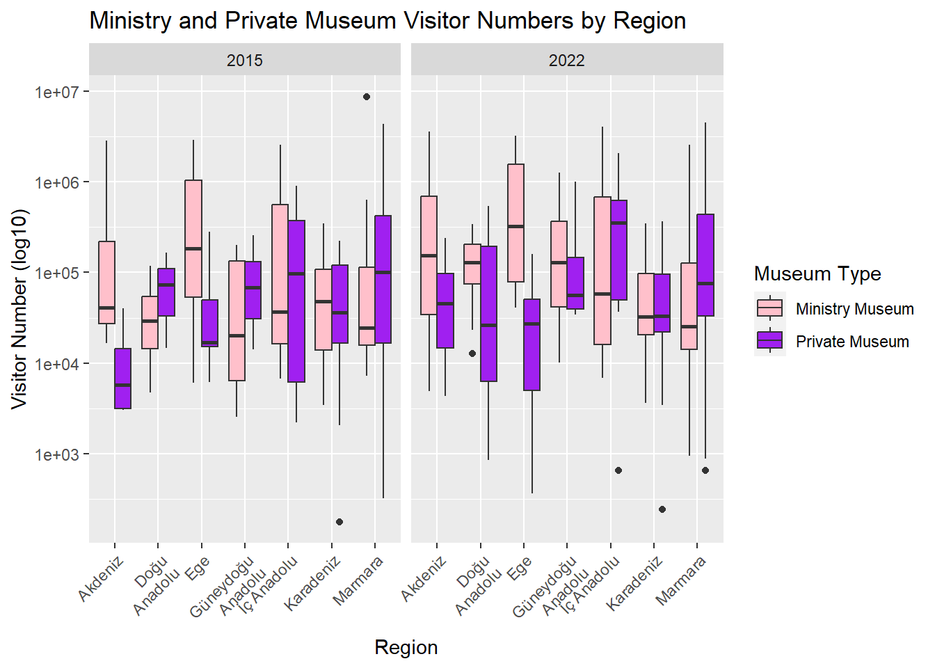
In the graph, the number of visitors of both ministry and private museums in each region is shown with box plot distributions. In the Akdeniz and Ege regions, the difference in visits to these two types of museums is more pronounced compared to other regions. Excluding the Karadeniz and Marmara regions, there has been an increase in visitor numbers to ministry museums in all regions over the years. Istanbul has the highest number of ministry museum visitors, while Düzce, excluding those with zero visitors, has the lowest number of private museum visitors.
3.3) Museum Visitor and Loaned Book
Show the code
data$total_museum_visitor_num <- data$ministry_museum_visitor_num+ data$private_museum_visitor_numdata %>%filter(year %in%c(2020,2018)) %>%pivot_longer(cols =c(total_museum_visitor_num,loaned_book_num), names_to ="Variable_Type", values_to ="Value") %>%ggplot(aes(x = region, y = Value, fill = Variable_Type)) +geom_boxplot(position ="dodge") +scale_y_log10() +labs(x ="Region", y ="Value (log10)", fill ="Variable Type") +ggtitle("Visitor Numbers and Loaned Book Rates by Region") +theme(axis.text.x =element_text(angle =45, hjust =1)) +scale_x_discrete(labels =function(x) str_wrap(x, width =10)) +facet_grid(.~year) +scale_fill_manual(values =c("darkgreen", "orange"), labels =c("Total Museum Visitor", "Loaned Book Rate"), name ="Variable Type")
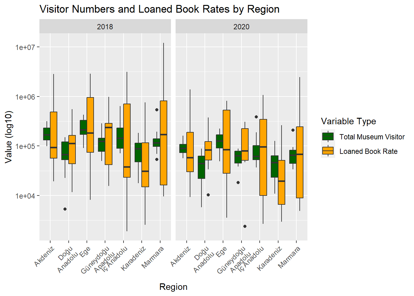
The graph focuses on the relationship between the total number of museum visitors in both state-run and private sectors and the number of borrowed books in the years 2018 and 2020. A significant observation from the graph is the high standard deviation in the number of borrowed books across all regions. This indicates pronounced differences in book borrowings, with these variations spreading over a wider range than anticipated. In contrast, the number of museum visitors presents a more consistent trend. This suggests that the count of visitors to museums varies less from region to region, exhibiting more stability. These insights help us understand the regional dynamics and interactions of library and museum services.
4) Rate Distributions
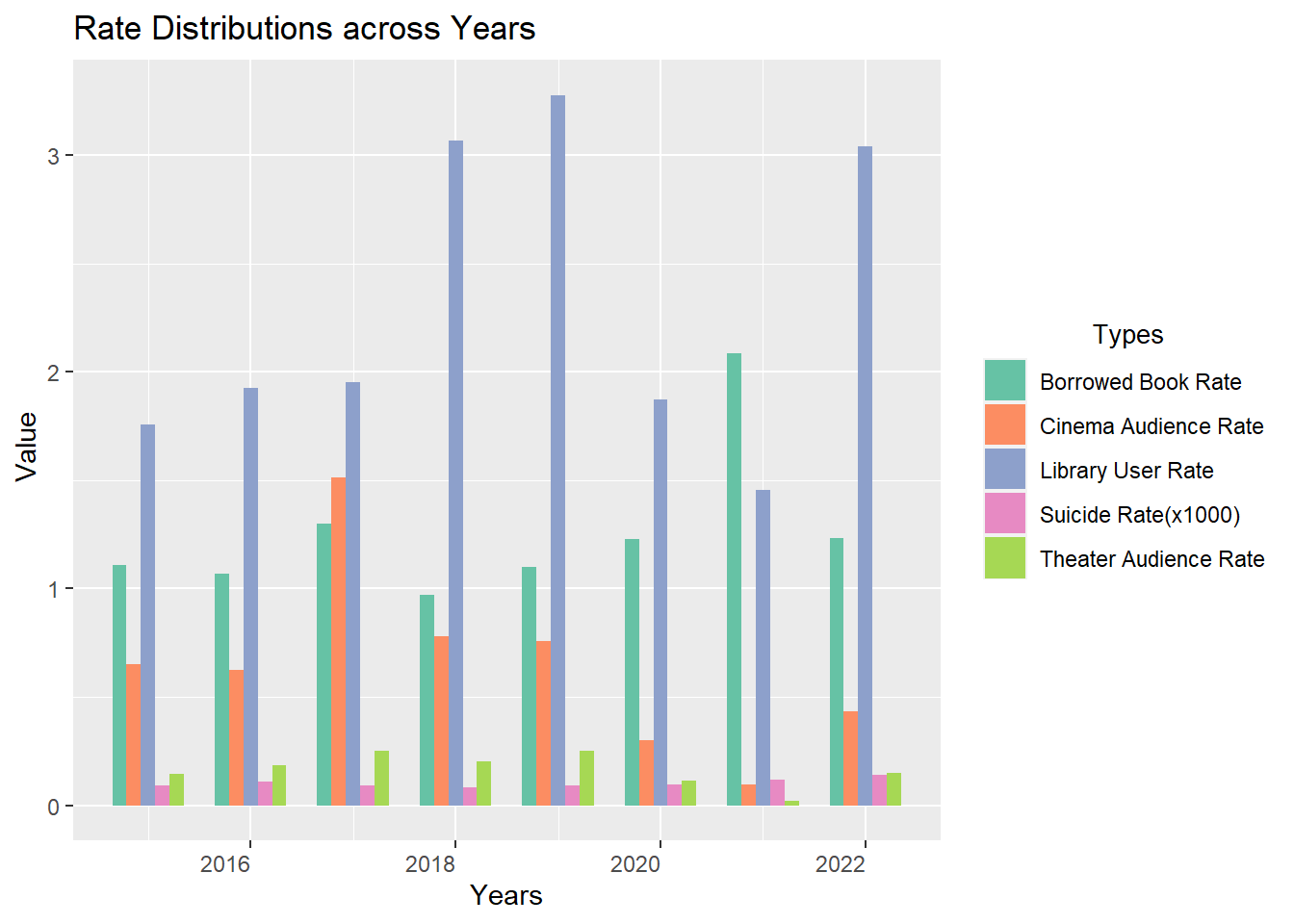
4.1) Rate Distributions across Years
Show the code
data$`Library User Rate`<- data$user_num / data$populationdata$`Borrowed Book Rate`<- data$loaned_book_num / data$user_numdata$`Suicide Rate(x1000)`<- data$suicides_num *1000/ data$populationdata$`Cinema Audience Rate`<- data$cinema_audiences_num / data$populationdata$`Theater Audience Rate`<- data$theater_audiences_num / data$populationrate_of_data <- data %>%select(city, year, `Library User Rate`, `Borrowed Book Rate`, `Suicide Rate(x1000)`, `Cinema Audience Rate`, `Theater Audience Rate`)tidy_data <- rate_of_data %>%pivot_longer(cols =c(`Library User Rate`, `Borrowed Book Rate`, `Suicide Rate(x1000)`, `Cinema Audience Rate`, `Theater Audience Rate`),names_to ="rate_type",values_to ="rate_value" )ggplot(tidy_data, aes(x = year, y = rate_value, fill = rate_type)) +geom_bar(stat ="identity", position ="dodge", width =0.7) +labs(title ="Rate Distributions across Years",x ="Years",y =" Value",fill =" Types" ) +theme(axis.text.x =element_text(angle =0, hjust =1),legend.title =element_text(size =10,hjust =0.5)) +scale_fill_brewer(palette ="Set2")
In the presented graph, various ratios are compared to discern trends. Notably, there was a sharp decline in the library usage rate from 2019 to 2020, potentially attributed to the global pandemic, which compelled individuals to spend more time at home. This decline persisted into 2021. However, by 2022, there was a sudden resurgence, almost reverting to its previous levels. Concurrently, recent years have witnessed a concerning rise in suicide rates.
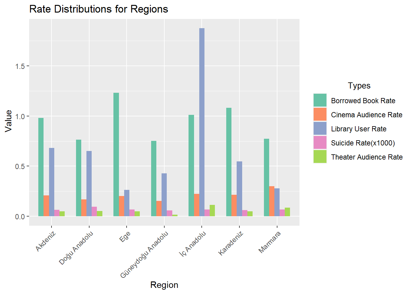
4.2) Rate Distributions for Regions
Show the code
data$`Library User Rate`<- data$user_num / data$populationdata$`Borrowed Book Rate`<- data$loaned_book_num / data$user_numdata$`Suicide Rate(x1000)`<- data$suicides_num *1000/ data$populationdata$`Cinema Audience Rate`<- data$cinema_audiences_num / data$populationdata$`Theater Audience Rate`<- data$theater_audiences_num / data$populationrate_of_data <- data %>%select(region, year, `Library User Rate`, `Borrowed Book Rate`, `Suicide Rate(x1000)`, `Cinema Audience Rate`, `Theater Audience Rate`)tidy_data <- rate_of_data %>%filter(year ==2020) %>%pivot_longer(cols =c(`Library User Rate`, `Borrowed Book Rate`, `Suicide Rate(x1000)`, `Cinema Audience Rate`, `Theater Audience Rate`),names_to ="rate_type",values_to ="rate_value" )ggplot(tidy_data, aes(x = region, y = rate_value, fill = rate_type)) +geom_bar(stat ="identity", position ="dodge", width =0.7) +labs(title ="Rate Distributions for Regions",x ="Region",y =" Value",fill =" Types" ) +theme(axis.text.x =element_text(angle =45, hjust =1),legend.title =element_text(size =10,hjust =0.5)) +scale_fill_brewer(palette ="Set2")
The graph provides a detailed examination of the previously mentioned ratios across different regions. Notably, the Central Anatolia region stands out with a notably higher library usage rate compared to other cities. In contrast, the Aegean region exhibits the least engagement in library services. Furthermore, when scrutinizing theater audience rates, the Southeastern Anatolia region registers a value close to zero, highlighting a significantly lower attendance or interest in theatrical performances in that area.
5) Top 10 Comparison
5.1) Cinema Audience Number of Top 10 Cities
Show the code
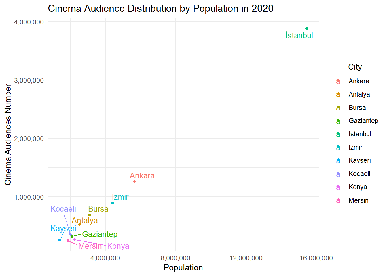
top_cities_2020 <- data %>%filter(year ==2020) %>%arrange(desc(cinema_audiences_num)) %>%slice(1:10)ggplot(top_cities_2020, aes(x = population, y = cinema_audiences_num, label = city, color = city)) +geom_point() +geom_text_repel(size =3.5) +theme_minimal() +labs(title ="Cinema Audience Distribution by Population in 2020",x ="Population",y ="Cinema Audiences Number") +scale_x_continuous(labels = scales::comma) +scale_y_continuous(labels = scales::comma)+theme(legend.title =element_text(size =10,hjust =0.5)) +guides(color =guide_legend(title ="City"))
Show the code
correlation <-cor(top_cities_2020$population, top_cities_2020$cinema_audiences_num, use ="complete.obs")cat("Correlation between population and cinema audiences number in 2020:",correlation,"\n")
Correlation between population and cinema audiences number in 2020: 0.9982036
The chart shows the distribution between the population of the provinces in Turkey and the number of people going to the cinema. The correlation coefficient of 0.9982, which is a very high value, indicates a strong linear relationship between population and cinema attendance numbers. Therefore, as we can see from the table and correlation value, as the population increases, the number of people going to the cinema increases almost at the same rate.
5.2) The Effect of Literacy Rate on Suicide Rates of Top 10 Cities
Show the code
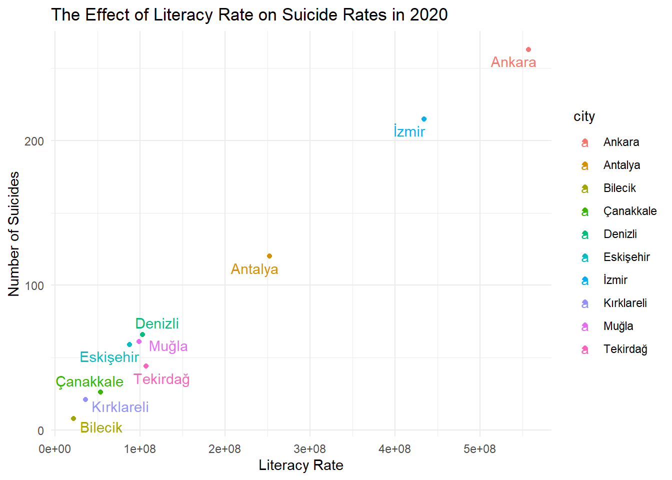
data_2020 <- data %>%filter(year ==2020)top_literacy_cities_2020 <- data_2020 %>%arrange(desc(literacy_rate)) %>%slice_head(n =10)ggplot(top_literacy_cities_2020, aes(x = literacy_rate * population, y = suicides_num, color = city)) +geom_point() +geom_text_repel(aes(label = city)) +labs(x ="Literacy Rate", y ="Number of Suicides",title ="The Effect of Literacy Rate on Suicide Rates in 2020") +theme_minimal() +theme(legend.position ="right")
Show the code
correlation <-cor(top_literacy_cities_2020$loaned_book_num, top_literacy_cities_2020$suicides_num, use ="complete.obs")cat("Correlation between loaned book number and number of suicides in 2020:",correlation,"\n")
Correlation between loaned book number and number of suicides in 2020: 0.971171
This graph depicts the relationship between literacy rates and suicide rates. The highest occurrences of both book reading and suicide cases are observed in Ankara; similarly, Izmir also has high values. The given correlation coefficient is 0.9949, which is very high and positive. Therefore, it can be stated that as literacy rates increase, so do suicide rates.
6) The Number of Historical Remnants in Cities
The aim here is to conduct a study on the number of museums in cities with historical remnants.
Show the code
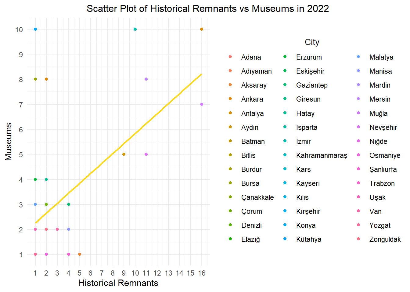
filtered_data <- data %>%filter(ruins_num >0)cor_historical_museums <-cor(filtered_data$ruins_num,filtered_data$ministry_museum_num)cat("The correlation between the number of historical remnants in cities with historical remnants and the number of museums.:",cor_historical_museums,"\n")
The correlation between the number of historical remnants in cities with historical remnants and the number of museums.: 0.6920828
It can be stated that there is a strong relationship according to the correlation.
Show the code
top10_museum <- filtered_data %>%filter(year ==2022) %>%arrange(desc(ministry_museum_num)) %>%head(10) %>%select(city, ministry_museum_num)kable(top10_museum, format ="html", caption ="The top 10 cities with the most museums in cities with historical remnants in 2022.",col.names =c("City", "Museums"),align =c("c", "c"))
The top 10 cities with the most museums in cities with historical remnants in 2022.
City
Museums
Antalya
10
Konya
10
İzmir
10
Ankara
8
Bursa
8
Mersin
8
Muğla
7
Aydın
5
Nevşehir
5
Erzurum
4
The table above shows the top 10 cities in Turkey for the year 2022 with the most museums in cities with historical remnants.
Show the code
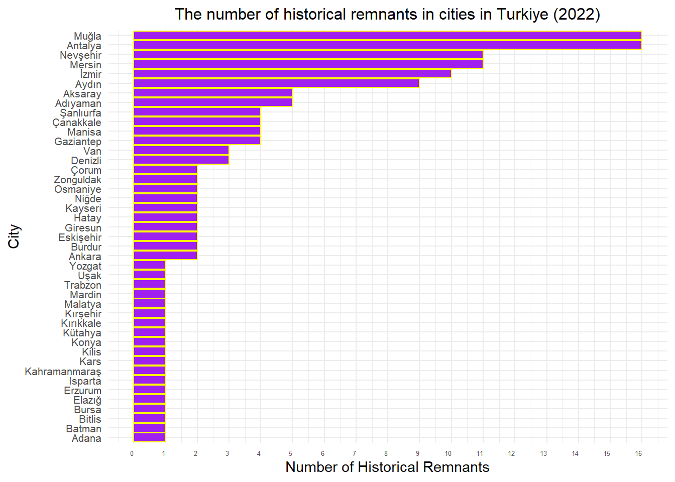
data %>%filter(year ==2022& ruins_num >0) %>%mutate(city =factor(city, levels =unique(city[order(ruins_num, decreasing =FALSE)]))) %>%arrange(desc(ruins_num)) %>%ggplot(aes(x = city, y = ruins_num)) +geom_bar(stat ="identity", fill ="purple", color ="yellow") +labs(x ="City", y ="Number of Historical Remnants") +ggtitle("The number of historical remnants in cities in Turkiye (2022)") +theme_minimal() +theme(legend.position ="none",axis.text.x =element_text(angle =0, hjust =1, size =5),axis.text.y =element_text(size =8),plot.title =element_text(size =12, hjust =0.5)) +scale_x_discrete(breaks =unique(data$city)) +scale_y_continuous(breaks =seq(0, max(data$ruins_num), by =1))+coord_flip()
This table illustrates the cities in Turkey with the most historical remnants for the year 2022. When we compare this with the previous table, we can observe similarities. Let’s visualize this as well.
Show the code
data%>%filter(year ==2022 ,ruins_num >0, ministry_museum_num >0) %>%ggplot(aes(x = ruins_num, y = ministry_museum_num, color = city)) +geom_point() +geom_smooth(method ="lm", se =FALSE, color ="#FBDA21", formula = y ~ x) +labs(x ="Historical Remnants", y ="Museums") +ggtitle("Scatter Plot of Historical Remnants vs Museums in 2022") +guides(color =guide_legend(title ="City"))+theme_minimal() +theme(plot.title =element_text(size =12, hjust =-1), legend.title =element_text(size =10,hjust =0.5 )) +scale_y_continuous(breaks =seq(0, max(data$ministry_museum_num), by =1)) +scale_x_continuous(breaks =seq(0, max(data$ruins_num), by =1))