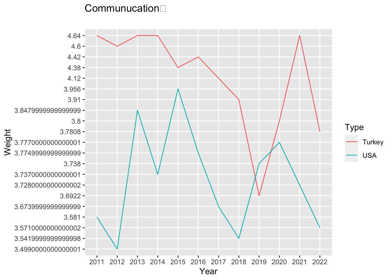
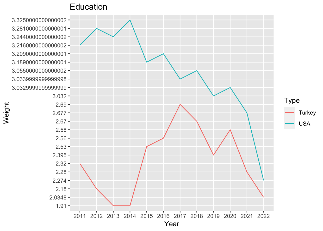
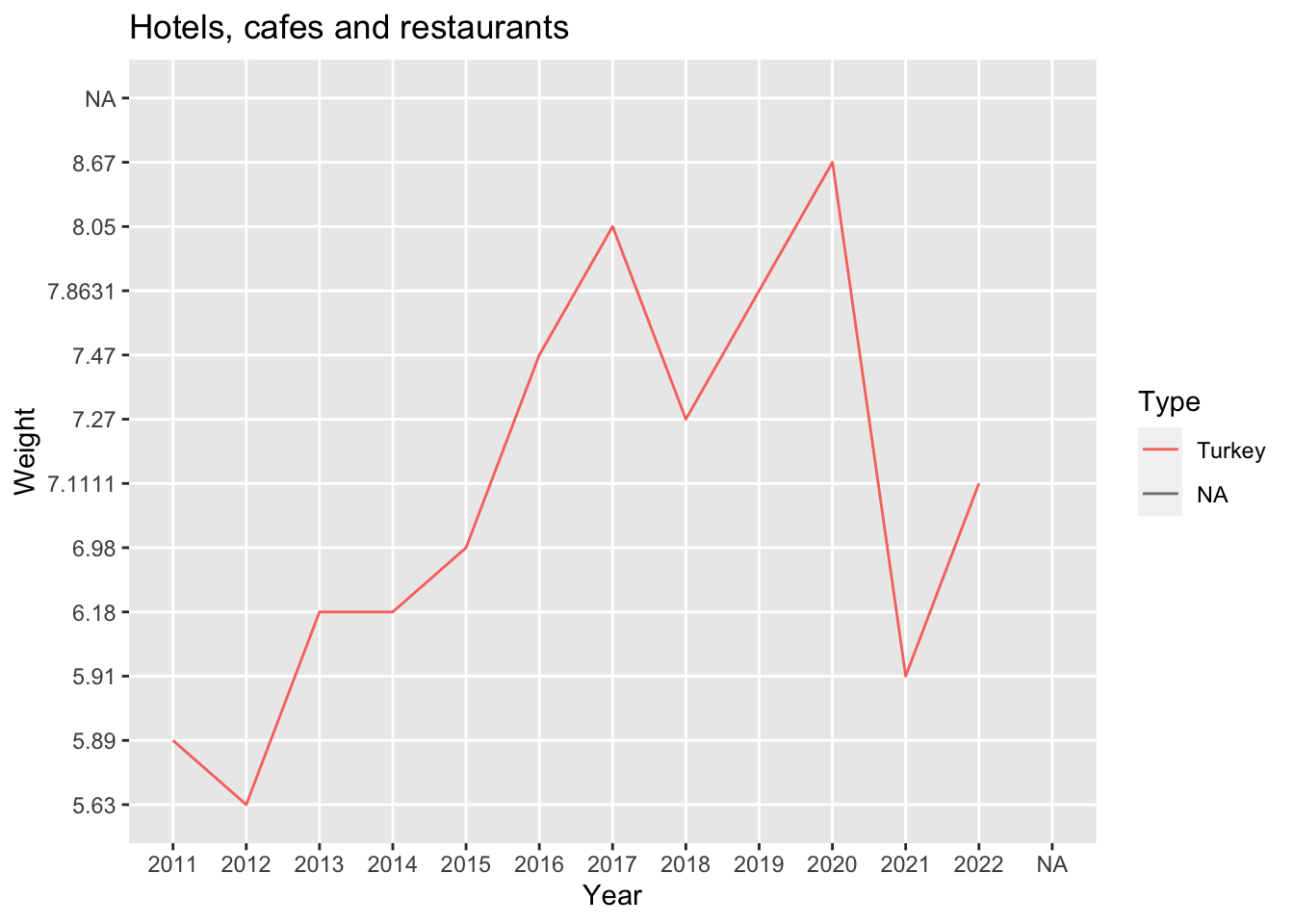
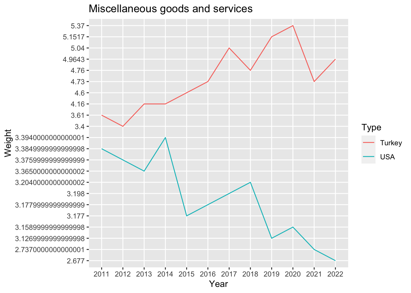
Our main goal as a team in this report is to make economic and sociological comments about the changes in the basket weights of the Consumer Price Index, the most common measurement method of inflation, over the years. Here, US data is taken as a developed base country data.

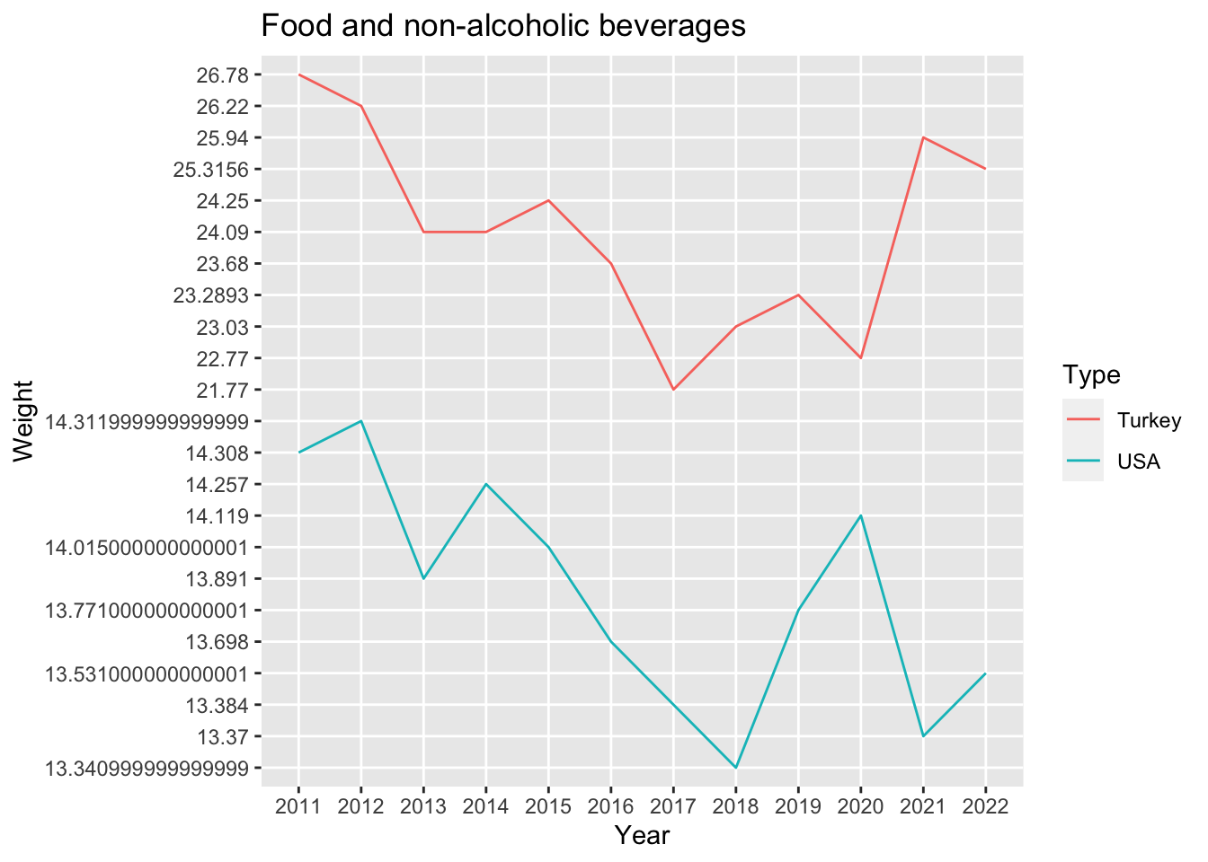
First of all, this chart is the graphical representation of the food group weight unit, which is the most basic weight unit of the CPI. There are two main reasons why the food weight group is the basic and most important weight group in the CPI. The first of these is that changes in the food weight group generally show a similar approach to the change and rate of CPI, that is, inflation. So, when you want to evaluate inflation in a general period, you can make a correct comment by looking at the food weight group. The second reason is that the average weight level of the eating weight group in a country actually provides information about the development level of that country. As can be clearly seen in the graph, the eating weight group values in Turkey, which is among the developing countries, have always been above the values in the developed country, America. The weight of the eating group decreases according to the development level of the countries. This will be the most important analysis throughout this report. In addition to the eating weight group, there is actually another weight group that we will analyze for development. You will see it in the rest of our analysis.

Actually, I would like to draw your attention to a very interesting detail. The pandemic has clearly shown its impact on the economy, as in all parts of life. Looking at the data in 2020-2021-2022, there is an increase in the pandemic in the eating weight group in Turkey and a decrease in the year the pandemic decreases (normally). This increase actually indicates an increase in inflation. However, the interesting thing is that in American data, the opposite is observed, that is, while there is a decrease in 2021, there is an increase in 2022. Roughly speaking, while inflation is decreasing in the United States in the midst of uncertainty such as a pandemic, what do you think could be the main reason for the increase in inflation in the period when uncertainty decreases?

library(dplyr)

Attaching package: 'dplyr'
The following objects are masked from 'package:stats':

    filter, lag
The following objects are masked from 'package:base':

    intersect, setdiff, setequal, union
library(readxl)
library(ggplot2)
library(tidyr)
TUIK_Weighted_Expenditure <- read_excel("/Users/gorkemgunes/Desktop/TUIK-Weighted-Expenditure.xlsx")
US_Weighted_Expenditure <- read_excel("/Users/gorkemgunes/Desktop/US-Weighted-Expenditure.xlsx")


df <- TUIK_Weighted_Expenditure


df_table <- df %>% 
  distinct(Year, Category, .keep_all = TRUE) %>%
  pivot_wider(names_from = Year, values_from= weight)
df_long <- df_table %>%
  pivot_longer(cols = -Category, names_to = "Year", values_to = "Weight")
subset_data_with_type <- df_long %>%
  mutate(Type = "Turkey")
subset_data <- subset_data_with_type[1:12, ]

df <- US_Weighted_Expenditure

df_short <- df %>% 
  distinct(Year, Category, .keep_all = TRUE) %>%
  pivot_wider(names_from = Year, values_from= Weight)
df_usa <- df_short %>%
  pivot_longer(cols = -Category, names_to = "Year", values_to = "Weight")
subset_data_usa <- df_usa %>%
  mutate(Type = "USA")
subset_usa <- subset_data_usa[1:12, ]
mixed_graph <- rbind(subset_data,subset_usa)
ggplot(mixed_graph, aes(x = Year, y = Weight, color = Type, group = Type)) +
  geom_line() +
  labs(title = unique(mixed_graph$Category),       x = "Year",
       y = "Weight")

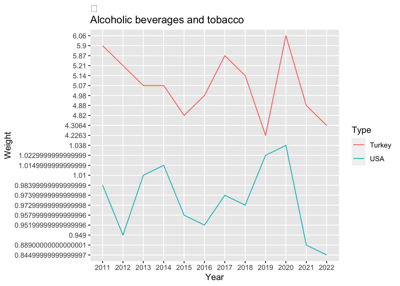
Secondly, in the chart below you see the values of the alcohol weight group in two countries. Here I would like to draw your attention to the difference between the weight values in Turkey and America. This chart actually directly shows the sociological effects, not the economic effects, of the CPI basket weight. Although sociological interpretations cannot be made as precisely as economic interpretations, it can be said that here is the effect of the prohibition pressure against alcohol and tobacco products in Turkish society, which was created together with politics and religion.

TUIK_Weighted_Expenditure <- read_excel("/Users/gorkemgunes/Desktop/TUIK-Weighted-Expenditure.xlsx")
US_Weighted_Expenditure <- read_excel("/Users/gorkemgunes/Desktop/US-Weighted-Expenditure.xlsx")


df <- TUIK_Weighted_Expenditure


df_table <- df %>% 
  distinct(Year, Category, .keep_all = TRUE) %>%
  pivot_wider(names_from = Year, values_from= weight)
df_long <- df_table %>%
  pivot_longer(cols = -Category, names_to = "Year", values_to = "Weight")
subset_data_with_type <- df_long %>%
  mutate(Type = "Turkey")
subset_data <- subset_data_with_type[13:24, ]

df <- US_Weighted_Expenditure

df_short <- df %>% 
  distinct(Year, Category, .keep_all = TRUE) %>%
  pivot_wider(names_from = Year, values_from= Weight)
df_usa <- df_short %>%
  pivot_longer(cols = -Category, names_to = "Year", values_to = "Weight")
subset_data_usa <- df_usa %>%
  mutate(Type = "USA")
subset_usa <- subset_data_usa[13:24, ]
mixed_graph <- rbind(subset_data,subset_usa)


ggplot(mixed_graph, aes(x = Year, y = Weight, color = Type, group = Type)) +
  geom_line() +
  labs(title = unique(mixed_graph$Category),       x = "Year",
       y = "Weight")

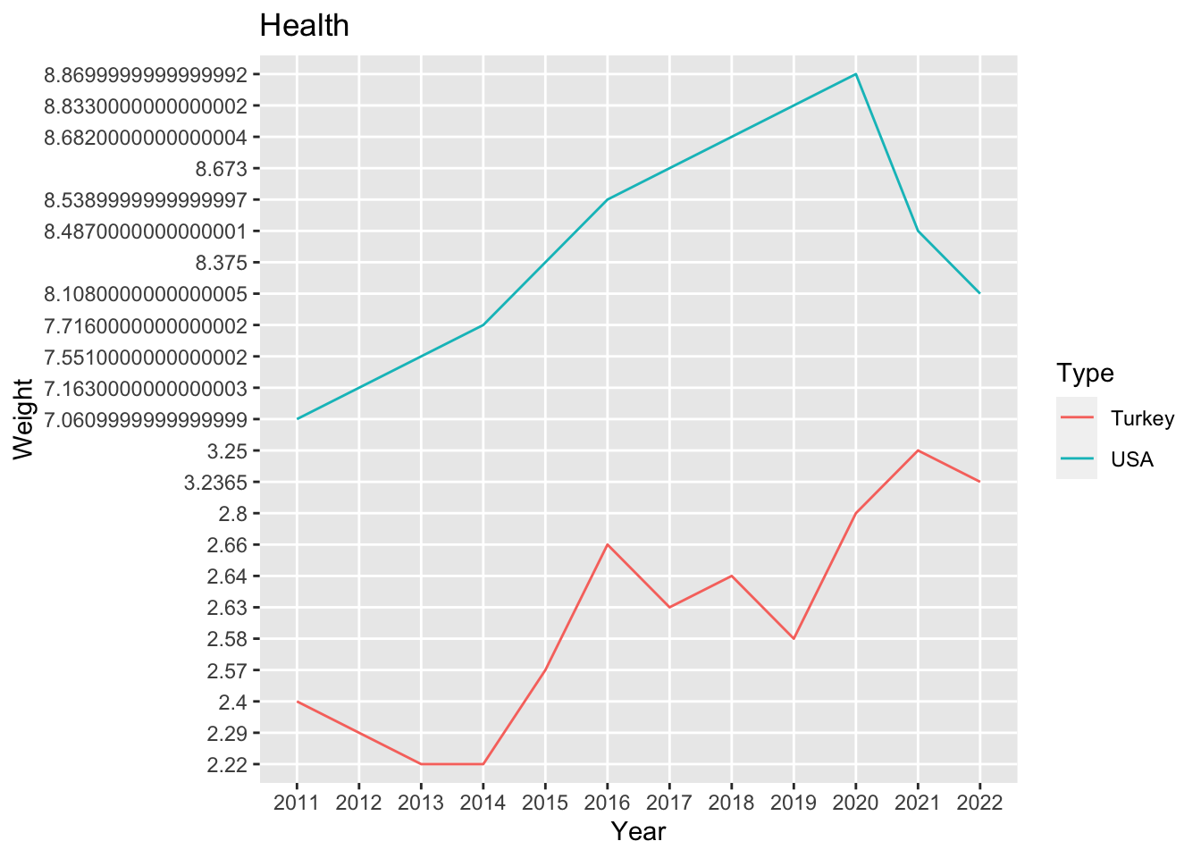
You can see another policy effect in the health weight group. The health system in Turkey generally continues under state management. On the contrary, there is a competitive environment in the healthcare system in America. You can understand this directly from the fact that it has a higher weight in the basket of consumers in America than consumers in Turkey.

TUIK_Weighted_Expenditure <- read_excel("/Users/gorkemgunes/Desktop/TUIK-Weighted-Expenditure.xlsx")
US_Weighted_Expenditure <- read_excel("/Users/gorkemgunes/Desktop/US-Weighted-Expenditure.xlsx")


df <- TUIK_Weighted_Expenditure


df_table <- df %>% 
  distinct(Year, Category, .keep_all = TRUE) %>%
  pivot_wider(names_from = Year, values_from= weight)
df_long <- df_table %>%
  pivot_longer(cols = -Category, names_to = "Year", values_to = "Weight")
subset_data_with_type <- df_long %>%
  mutate(Type = "Turkey")
subset_data <- subset_data_with_type[61:72, ]

df <- US_Weighted_Expenditure

df_short <- df %>% 
  distinct(Year, Category, .keep_all = TRUE) %>%
  pivot_wider(names_from = Year, values_from= Weight)
df_usa <- df_short %>%
  pivot_longer(cols = -Category, names_to = "Year", values_to = "Weight")
subset_data_usa <- df_usa %>%
  mutate(Type = "USA")
subset_usa <- subset_data_usa[49:60, ]
mixed_graph <- rbind(subset_data,subset_usa)

ggplot(mixed_graph, aes(x = Year, y = Weight, color = Type, group = Type)) +
  geom_line() +
  labs(title = unique(mixed_graph$Category),       x = "Year",
       y = "Weight")

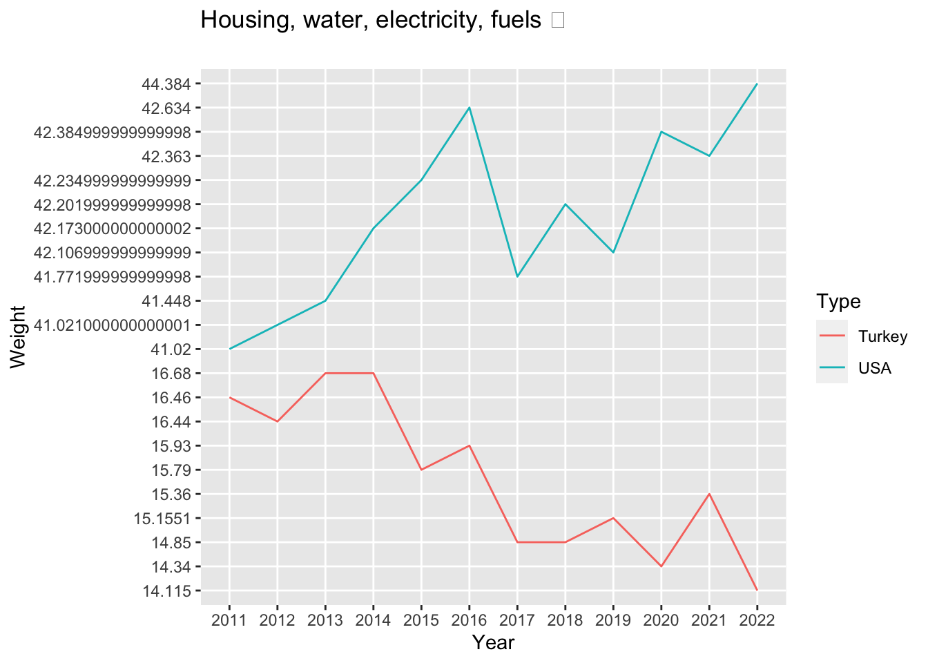
Our other chart that clearly shows the impact of economic decisions on the weight units in the consumer’s CPI basket is the housing weight group. As you can see, the weight of the housing group in America is much greater than in Turkey. The main reason for this is that there is actually a mortgage industry in America and this is supported and encouraged by the state.

TUIK_Weighted_Expenditure <- read_excel("/Users/gorkemgunes/Desktop/TUIK-Weighted-Expenditure.xlsx")
US_Weighted_Expenditure <- read_excel("/Users/gorkemgunes/Desktop/US-Weighted-Expenditure.xlsx")


df <- TUIK_Weighted_Expenditure


df_table <- df %>% 
  distinct(Year, Category, .keep_all = TRUE) %>%
  pivot_wider(names_from = Year, values_from= weight)
df_long <- df_table %>%
  pivot_longer(cols = -Category, names_to = "Year", values_to = "Weight")
subset_data_with_type <- df_long %>%
  mutate(Type = "Turkey")
subset_data <- subset_data_with_type[37:48, ]

df <- US_Weighted_Expenditure

df_short <- df %>% 
  distinct(Year, Category, .keep_all = TRUE) %>%
  pivot_wider(names_from = Year, values_from= Weight)
df_usa <- df_short %>%
  pivot_longer(cols = -Category, names_to = "Year", values_to = "Weight")
subset_data_usa <- df_usa %>%
  mutate(Type = "USA")
subset_usa <- subset_data_usa[37:48, ]
mixed_graph <- rbind(subset_data,subset_usa)


ggplot(mixed_graph, aes(x = Year, y = Weight, color = Type, group = Type)) +
  geom_line() +
  labs(title = unique(mixed_graph$Category),       x = "Year",
       y = "Weight")

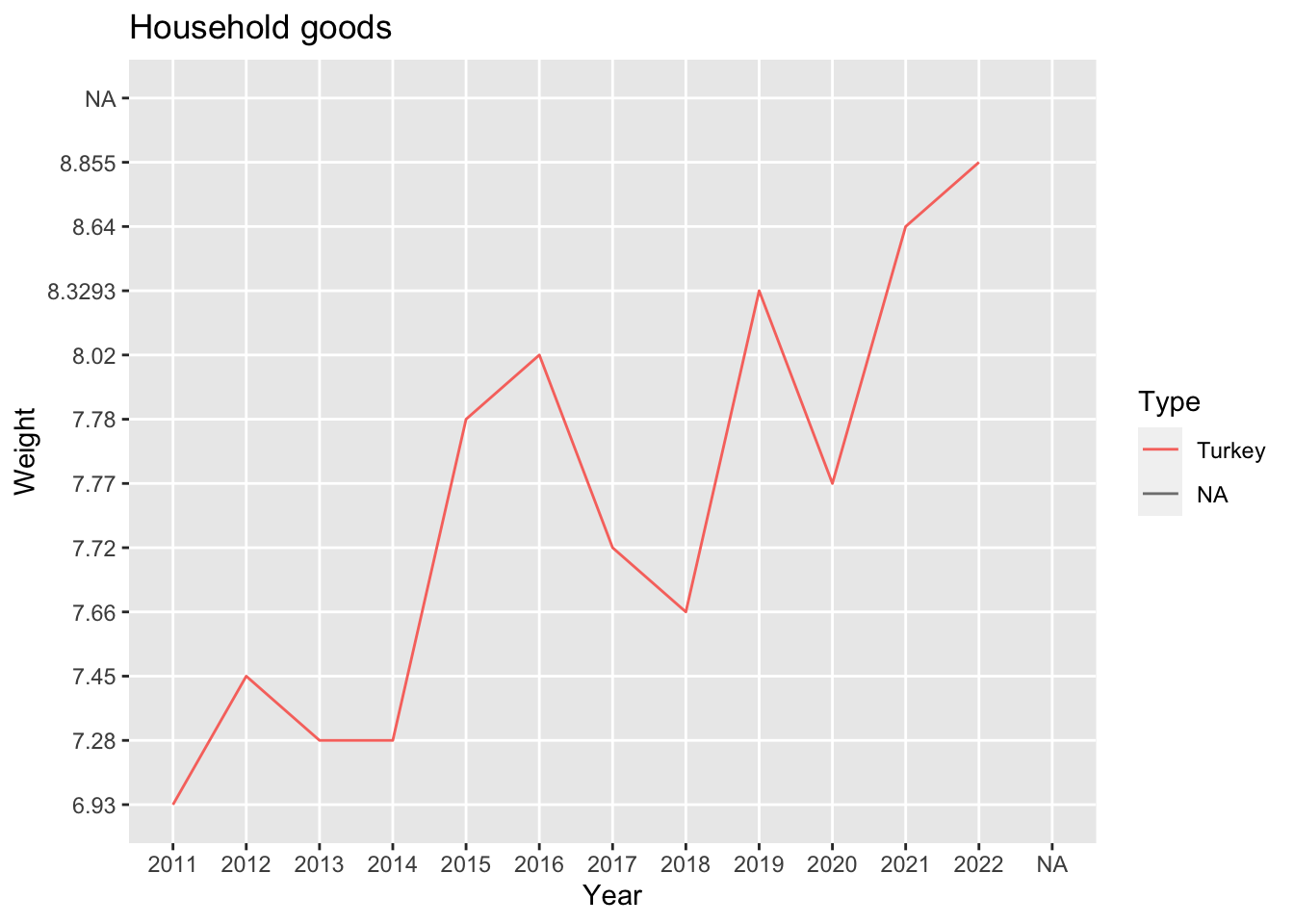
In the chart below, the graph of the household good weight group only in Turkey is depicted. The main reason for this is that such a weight group is not included in the American CPI basket. This is an indication that the weight groups in the CPI may vary depending on the spending behavior and cultural structure of the society in that country.

TUIK_Weighted_Expenditure <- read_excel("/Users/gorkemgunes/Desktop/TUIK-Weighted-Expenditure.xlsx")
US_Weighted_Expenditure <- read_excel("/Users/gorkemgunes/Desktop/US-Weighted-Expenditure.xlsx")


df <- TUIK_Weighted_Expenditure


df_table <- df %>% 
  distinct(Year, Category, .keep_all = TRUE) %>%
  pivot_wider(names_from = Year, values_from= weight)
df_long <- df_table %>%
  pivot_longer(cols = -Category, names_to = "Year", values_to = "Weight")
subset_data_with_type <- df_long %>%
  mutate(Type = "Turkey")
subset_data <- subset_data_with_type[49:60,  ]

df <- US_Weighted_Expenditure

df_short <- df %>% 
  distinct(Year, Category, .keep_all = TRUE) %>%
  pivot_wider(names_from = Year, values_from= Weight)
df_usa <- df_short %>%
  pivot_longer(cols = -Category, names_to = "Year", values_to = "Weight")
subset_data_usa <- df_usa %>%
  mutate(Type = "USA")
subset_usa <- subset_data_usa[150:161, ]
mixed_graph <- rbind(subset_data,subset_usa)


ggplot(mixed_graph, aes(x = Year, y = Weight, color = Type, group = Type)) +
  geom_line() +
  labs(title = unique(mixed_graph$Category),       x = "Year",
       y = "Weight")

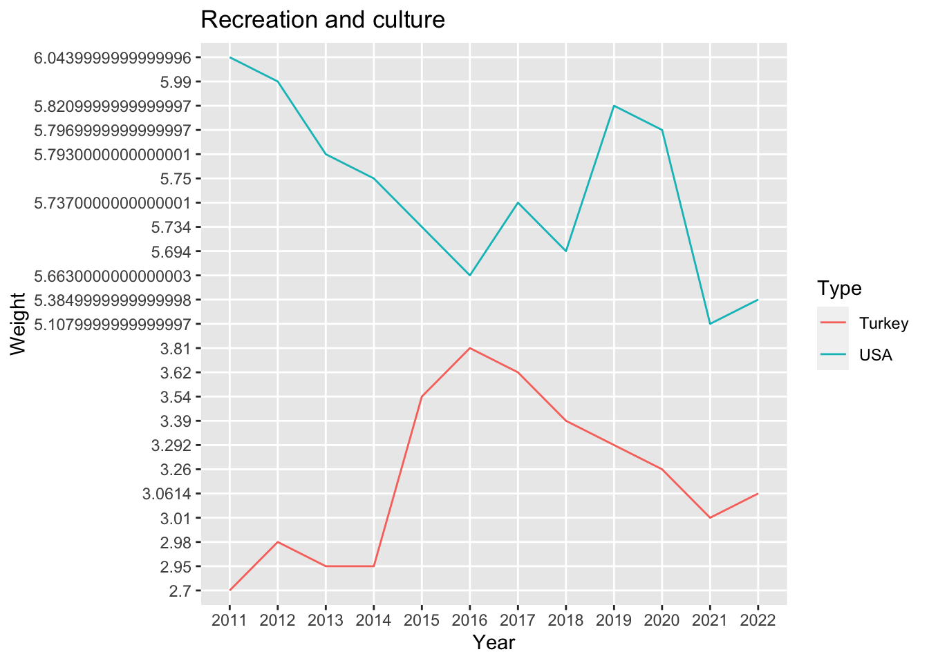
The recreation and culture weight group below is the weight group that gives information about the other development mentioned at the beginning of the analysis. As you can see in the chart, the basket weight of America, a developed country, is higher than the basket weight of developing Turkey. In addition, the impact of the decreasing purchasing power in Turkey in recent years on society is clearly seen. With decreasing purchasing power, people give up their entertainment or social activities.

TUIK_Weighted_Expenditure <- read_excel("/Users/gorkemgunes/Desktop/TUIK-Weighted-Expenditure.xlsx")
US_Weighted_Expenditure <- read_excel("/Users/gorkemgunes/Desktop/US-Weighted-Expenditure.xlsx")


df <- TUIK_Weighted_Expenditure


df_table <- df %>% 
  distinct(Year, Category, .keep_all = TRUE) %>%
  pivot_wider(names_from = Year, values_from= weight)
df_long <- df_table %>%
  pivot_longer(cols = -Category, names_to = "Year", values_to = "Weight")
subset_data_with_type <- df_long %>%
  mutate(Type = "Turkey")
subset_data <- subset_data_with_type[97:108, ]

df <- US_Weighted_Expenditure

df_short <- df %>% 
  distinct(Year, Category, .keep_all = TRUE) %>%
  pivot_wider(names_from = Year, values_from= Weight)
df_usa <- df_short %>%
  pivot_longer(cols = -Category, names_to = "Year", values_to = "Weight")
subset_data_usa <- df_usa %>%
  mutate(Type = "USA")
subset_usa <- subset_data_usa[85:96, ]
mixed_graph <- rbind(subset_data,subset_usa)


ggplot(mixed_graph, aes(x = Year, y = Weight, color = Type, group = Type)) +
  geom_line() +
  labs(title = unique(mixed_graph$Category),       x = "Year",
       y = "Weight")

TUIK_Weighted_Expenditure <- read_excel("/Users/gorkemgunes/Desktop/TUIK-Weighted-Expenditure.xlsx")
US_Weighted_Expenditure <- read_excel("/Users/gorkemgunes/Desktop/US-Weighted-Expenditure.xlsx")


df <- TUIK_Weighted_Expenditure


df_table <- df %>% 
  distinct(Year, Category, .keep_all = TRUE) %>%
  pivot_wider(names_from = Year, values_from= weight)
df_long <- df_table %>%
  pivot_longer(cols = -Category, names_to = "Year", values_to = "Weight")
subset_data_with_type <- df_long %>%
  mutate(Type = "Turkey")
subset_data <- subset_data_with_type[73:84, ]

df <- US_Weighted_Expenditure

df_short <- df %>% 
  distinct(Year, Category, .keep_all = TRUE) %>%
  pivot_wider(names_from = Year, values_from= Weight)
df_usa <- df_short %>%
  pivot_longer(cols = -Category, names_to = "Year", values_to = "Weight")
subset_data_usa <- df_usa %>%
  mutate(Type = "USA")
subset_usa <- subset_data_usa[61:72, ]
mixed_graph <- rbind(subset_data,subset_usa)


ggplot(mixed_graph, aes(x = Year, y = Weight, color = Type, group = Type)) +
  geom_line() +
  labs(title = unique(mixed_graph$Category),       x = "Year",
       y = "Weight")

TUIK_Weighted_Expenditure <- read_excel("/Users/gorkemgunes/Desktop/TUIK-Weighted-Expenditure.xlsx")
US_Weighted_Expenditure <- read_excel("/Users/gorkemgunes/Desktop/US-Weighted-Expenditure.xlsx")


df <- TUIK_Weighted_Expenditure


df_table <- df %>% 
  distinct(Year, Category, .keep_all = TRUE) %>%
  pivot_wider(names_from = Year, values_from= weight)
df_long <- df_table %>%
  pivot_longer(cols = -Category, names_to = "Year", values_to = "Weight")
subset_data_with_type <- df_long %>%
  mutate(Type = "Turkey")
subset_data <- subset_data_with_type[25:36, ]

df <- US_Weighted_Expenditure

df_short <- df %>% 
  distinct(Year, Category, .keep_all = TRUE) %>%
  pivot_wider(names_from = Year, values_from= Weight)
df_usa <- df_short %>%
  pivot_longer(cols = -Category, names_to = "Year", values_to = "Weight")
subset_data_usa <- df_usa %>%
  mutate(Type = "USA")
subset_usa <- subset_data_usa[25:36, ]
mixed_graph <- rbind(subset_data,subset_usa)


ggplot(mixed_graph, aes(x = Year, y = Weight, color = Type, group = Type)) +
  geom_line() +
  labs(title = unique(mixed_graph$Category),       x = "Year",
       y = "Weight")

TUIK_Weighted_Expenditure <-read_excel("/Users/gorkemgunes/Desktop/TUIK-Weighted-Expenditure.xlsx")
US_Weighted_Expenditure <- read_excel("/Users/gorkemgunes/Desktop/US-Weighted-Expenditure.xlsx")


df <- TUIK_Weighted_Expenditure


df_table <- df %>% 
  distinct(Year, Category, .keep_all = TRUE) %>%
  pivot_wider(names_from = Year, values_from= weight)
df_long <- df_table %>%
  pivot_longer(cols = -Category, names_to = "Year", values_to = "Weight")
subset_data_with_type <- df_long %>%
  mutate(Type = "Turkey")
subset_data <- subset_data_with_type[85:96, ]

df <- US_Weighted_Expenditure

df_short <- df %>% 
  distinct(Year, Category, .keep_all = TRUE) %>%
  pivot_wider(names_from = Year, values_from= Weight)
df_usa <- df_short %>%
  pivot_longer(cols = -Category, names_to = "Year", values_to = "Weight")
subset_data_usa <- df_usa %>%
  mutate(Type = "USA")
subset_usa <- subset_data_usa[73:84, ]
mixed_graph <- rbind(subset_data,subset_usa)


ggplot(mixed_graph, aes(x = Year, y = Weight, color = Type, group = Type)) +
  geom_line() +
  labs(title = unique(mixed_graph$Category),       x = "Year",
       y = "Weight")

TUIK_Weighted_Expenditure <- read_excel("/Users/gorkemgunes/Desktop/TUIK-Weighted-Expenditure.xlsx")
US_Weighted_Expenditure <- read_excel("/Users/gorkemgunes/Desktop/US-Weighted-Expenditure.xlsx")


df <- TUIK_Weighted_Expenditure


df_table <- df %>% 
  distinct(Year, Category, .keep_all = TRUE) %>%
  pivot_wider(names_from = Year, values_from= weight)
df_long <- df_table %>%
  pivot_longer(cols = -Category, names_to = "Year", values_to = "Weight")
subset_data_with_type <- df_long %>%
  mutate(Type = "Turkey")
subset_data <- subset_data_with_type[109:120, ]

df <- US_Weighted_Expenditure

df_short <- df %>% 
  distinct(Year, Category, .keep_all = TRUE) %>%
  pivot_wider(names_from = Year, values_from= Weight)
df_usa <- df_short %>%
  pivot_longer(cols = -Category, names_to = "Year", values_to = "Weight")
subset_data_usa <- df_usa %>%
  mutate(Type = "USA")
subset_usa <- subset_data_usa[97:108, ]
mixed_graph <- rbind(subset_data,subset_usa)


ggplot(mixed_graph, aes(x = Year, y = Weight, color = Type, group = Type)) +
  geom_line() +
  labs(title = unique(mixed_graph$Category),       x = "Year",
       y = "Weight")

TUIK_Weighted_Expenditure <- read_excel("/Users/gorkemgunes/Desktop/TUIK-Weighted-Expenditure.xlsx")
US_Weighted_Expenditure <- read_excel("/Users/gorkemgunes/Desktop/US-Weighted-Expenditure.xlsx")


df <- TUIK_Weighted_Expenditure


df_table <- df %>% 
  distinct(Year, Category, .keep_all = TRUE) %>%
  pivot_wider(names_from = Year, values_from= weight)
df_long <- df_table %>%
  pivot_longer(cols = -Category, names_to = "Year", values_to = "Weight")
subset_data_with_type <- df_long %>%
  mutate(Type = "Turkey")
subset_data <- subset_data_with_type[121:132, ]

df <- US_Weighted_Expenditure

df_short <- df %>% 
  distinct(Year, Category, .keep_all = TRUE) %>%
  pivot_wider(names_from = Year, values_from= Weight)
df_usa <- df_short %>%
  pivot_longer(cols = -Category, names_to = "Year", values_to = "Weight")
subset_data_usa <- df_usa %>%
  mutate(Type = "USA")
subset_usa <- subset_data_usa[150:161, ]
mixed_graph <- rbind(subset_data,subset_usa)


ggplot(mixed_graph, aes(x = Year, y = Weight, color = Type, group = Type)) +
  geom_line() +
  labs(title = unique(mixed_graph$Category),       x = "Year",
       y = "Weight")

TUIK_Weighted_Expenditure <- read_excel("/Users/gorkemgunes/Desktop/TUIK-Weighted-Expenditure.xlsx")
US_Weighted_Expenditure <- read_excel("/Users/gorkemgunes/Desktop/US-Weighted-Expenditure.xlsx")


df <- TUIK_Weighted_Expenditure


df_table <- df %>% 
  distinct(Year, Category, .keep_all = TRUE) %>%
  pivot_wider(names_from = Year, values_from= weight)
df_long <- df_table %>%
  pivot_longer(cols = -Category, names_to = "Year", values_to = "Weight")
subset_data_with_type <- df_long %>%
  mutate(Type = "Turkey")
subset_data <- subset_data_with_type[133:144, ]

df <- US_Weighted_Expenditure

df_short <- df %>% 
  distinct(Year, Category, .keep_all = TRUE) %>%
  pivot_wider(names_from = Year, values_from= Weight)
df_usa <- df_short %>%
  pivot_longer(cols = -Category, names_to = "Year", values_to = "Weight")
subset_data_usa <- df_usa %>%
  mutate(Type = "USA")
subset_usa <- subset_data_usa[109:120, ]
mixed_graph <- rbind(subset_data,subset_usa)


ggplot(mixed_graph, aes(x = Year, y = Weight, color = Type, group = Type)) +
  geom_line() +
  labs(title = unique(mixed_graph$Category),       x = "Year",
       y = "Weight")

Throughout this analysis, country-based sociological and economic interpretations of some basket weights in the CPI were made.

Back to top