First of all, we generated the data that would be useful to us from TURKSTAT’s website. After downloading the data as an Excel file, we changed the positions of the columns and raws, making it easier to work on it. Next, we anchored the rows and columns of the data so that R could read them. Finally, we created column headings for the cities.
Length:81 Min. : 5 Min. : 4 Min. : 4
Class :character 1st Qu.: 192 1st Qu.: 213 1st Qu.: 240
Mode :character Median : 447 Median : 603 Median : 941
Mean : 1048 Mean : 1419 Mean : 1914
3rd Qu.: 939 3rd Qu.: 1364 3rd Qu.: 1663
Max. :19700 Max. :26700 Max. :33938
2017 2018 2019 2020
Min. : 5 Min. : 5 Min. : 6 Min. : 8
1st Qu.: 178 1st Qu.: 264 1st Qu.: 381 1st Qu.: 376
Median : 1088 Median : 1303 Median : 1354 Median : 1224
Mean : 2309 Mean : 3425 Mean : 4082 Mean : 3570
3rd Qu.: 2076 3rd Qu.: 2932 3rd Qu.: 3401 3rd Qu.: 2991
Max. :46736 Max. :71830 Max. :92286 Max. :66703
2021 2022
Min. : 11 Min. : 11
1st Qu.: 505 1st Qu.: 449
Median : 1272 Median : 1313
Mean : 4506 Mean : 4561
3rd Qu.: 3276 3rd Qu.: 3029
Max. :113605 Max. :118735
Show the code
# Veri çerçevesini oluşturmean_values <- dataset %>%gather(key ="Year", value ="Value", -City) %>%group_by(Year) %>%summarize(mean_value =mean(Value, na.rm =TRUE))# Veri çerçevesini kontrol etprint(mean_values)
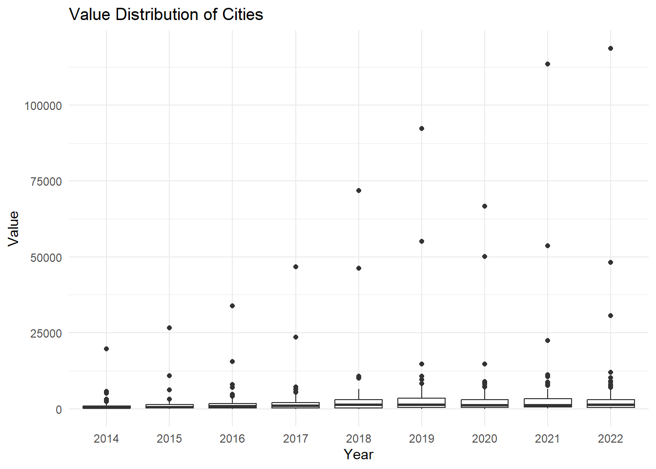
# Drawing a boxplot of values by citydataset_long <-melt(dataset, id.vars ="City")ggplot(dataset_long, aes(x = variable, y = value)) +geom_boxplot() +labs(title ="Value Distribution of Cities",x ="Year",y ="Value") +theme_minimal()
Show the code
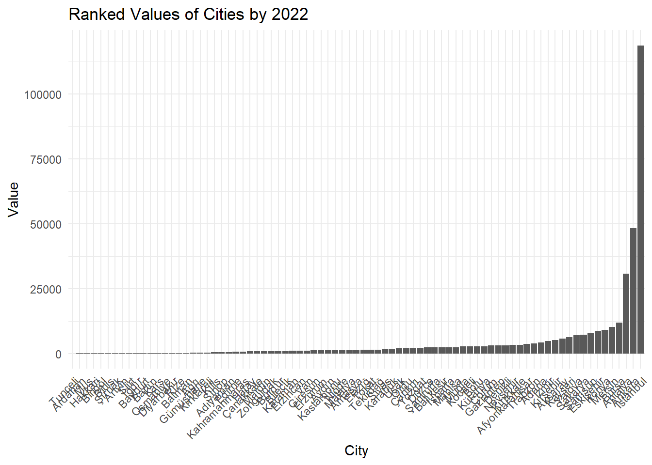
# Showing ranked values of cities for 2022dataset_2022 <- dataset %>%select(City, `2022`) %>%arrange(desc(`2022`))ggplot(dataset_2022, aes(x =reorder(City, `2022`), y =`2022`)) +geom_bar(stat ="identity") +labs(title ="Ranked Values of Cities by 2022",x ="City",y ="Value") +theme_minimal() +theme(axis.text.x =element_text(angle =45, hjust =1))
Show the code
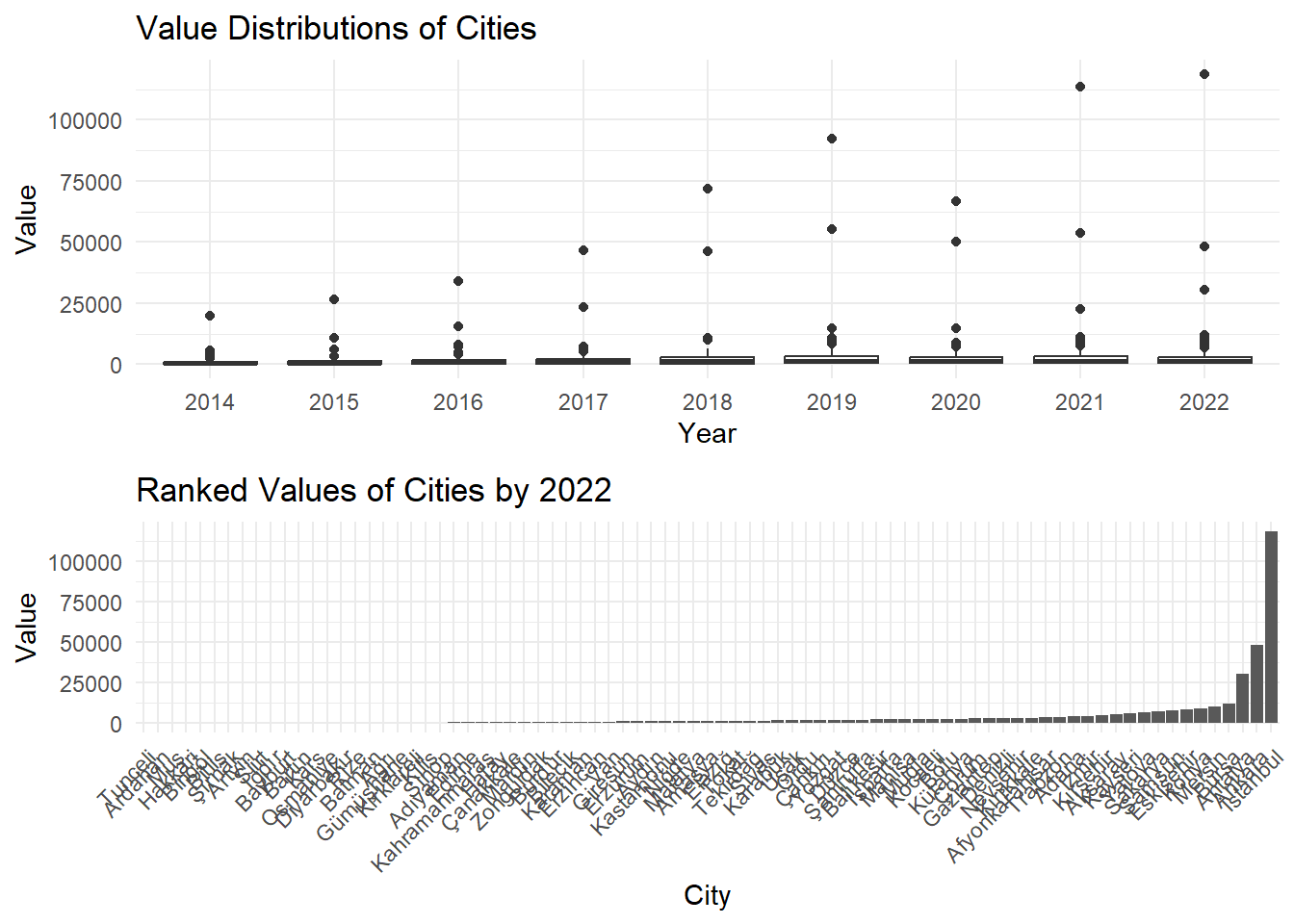
# Bring related charts togethergrid.arrange(ggplot(dataset_long, aes(x = variable, y = value)) +geom_boxplot() +labs(title ="Value Distributions of Cities",x ="Year",y ="Value") +theme_minimal(),ggplot(dataset_2022, aes(x =reorder(City, `2022`), y =`2022`)) +geom_bar(stat ="identity") +labs(title ="Ranked Values of Cities by 2022",x ="City",y ="Value") +theme_minimal() +theme(axis.text.x =element_text(angle =45, hjust =1)),ncol =1)
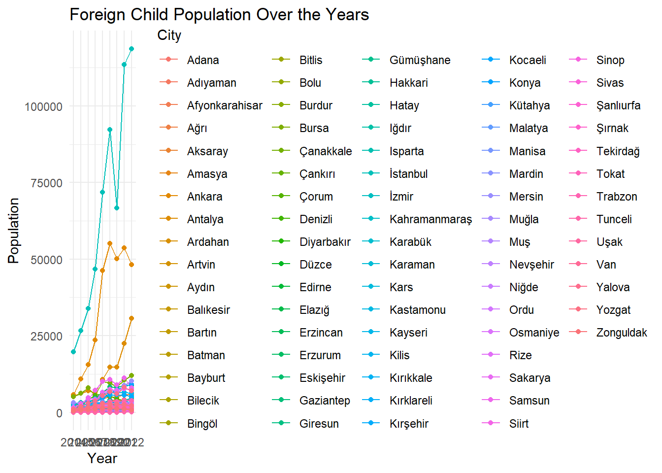
Visualization to see trends We visualized the data set as a line graph. In this way , data visualization of all cities was achieved at once.
Show the code
# We converted the data to long format for ggplot2library(tidyr)foreign_child_long <-gather(dataset, key ="Year", value ="Value", -City)# Code for Printing the structure and head of the data frame for inspectionstr(foreign_child_long)
City Year Value 1 Adana 2014 2416 2 Adıyaman 2014 57 3 Afyonkarahisar 2014 1027 4 Ağrı 2014 198 5 Aksaray 2014 1482 6 Amasya 2014 347
Show the code
# Converting the 'Year' column to a factor for correct orderingforeign_child_long$Year <-factor(foreign_child_long$Year, levels =c("2014", "2015", "2016", "2017", "2018", "2019", "2020", "2021", "2022"))# Checking the levels of the 'Year' factorlevels(foreign_child_long$Year)
# Creating a line plotlibrary(ggplot2)ggplot(foreign_child_long, aes(x = Year, y = Value, group = City, color = City)) +geom_line() +geom_point() +labs(title ="Foreign Child Population Over the Years",x ="Year",y ="Population") +theme_minimal()
As we expected, the number in densely populated cities such as Istanbul and Ankara was much higher than other cities. But what was surprising was the density in Antalya. Antalya, which is not among the top 5 provinces of Turkey in terms of population density, had a higher density than expected. Having all 81 cities on a single line chart did not provide a very efficient analysis facility. We added the columns of the data set and plotted the total number between 2014 and 2022 on a line chart. In this way, a trend that is the average of all cities can be observed.
# We converted the data to long format for ggplot2library(tidyr)foreign_child_long <-gather(dataset, key ="Year", value ="Value", -City)# Code for Printing the structure and head of the data frame for inspectionstr(foreign_child_long)
# A tibble: 6 × 3
  City           Year  Value
  <chr>          <chr> <dbl>
1 Adana          2014   2416
2 Adıyaman       2014     57
3 Afyonkarahisar 2014   1027
4 Ağrı           2014    198
5 Aksaray        2014   1482
6 Amasya         2014    347
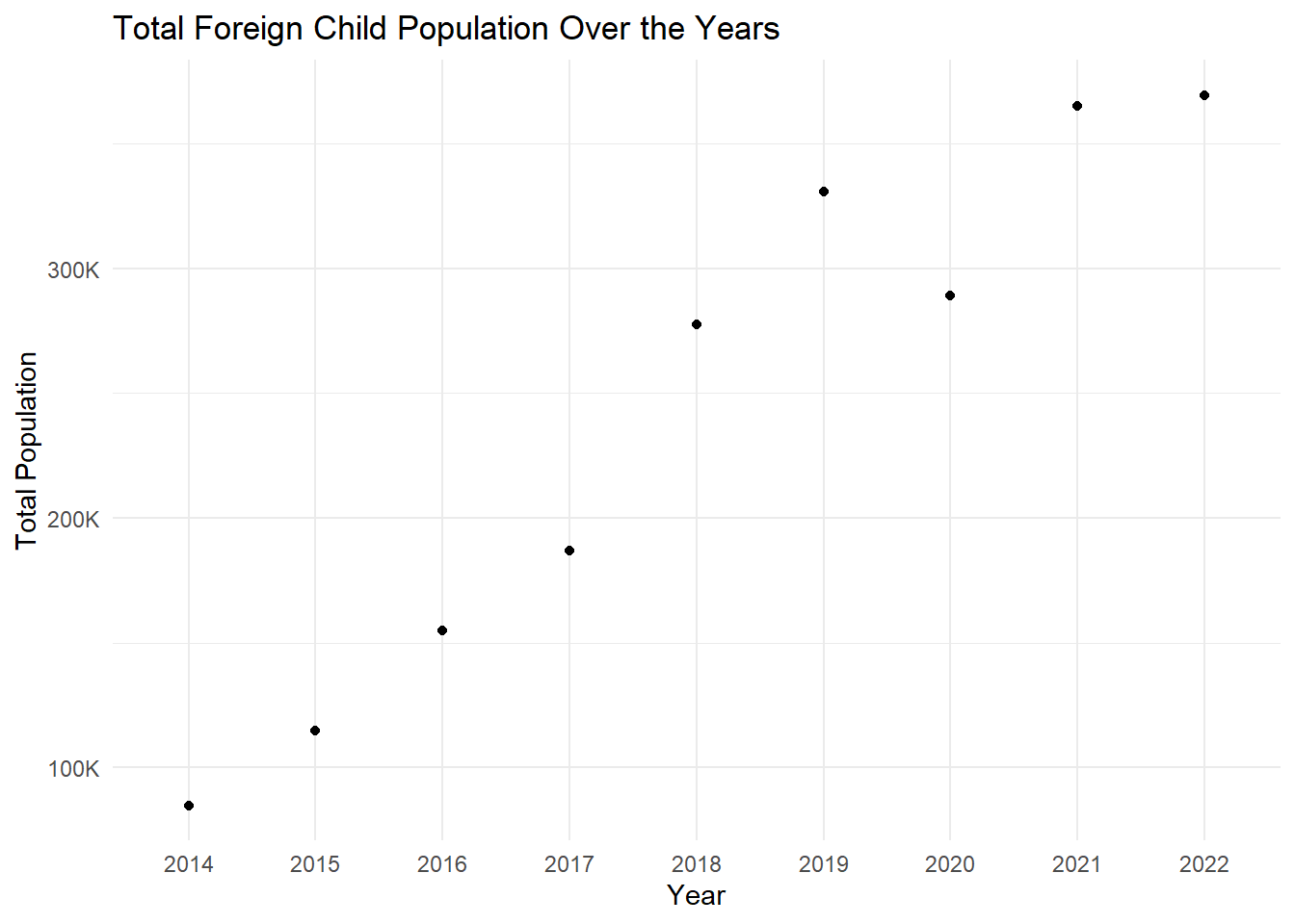
# Converting the 'Year' column to a factor for correct orderingforeign_child_long$Year <-factor(foreign_child_long$Year, levels =c("2014", "2015", "2016", "2017", "2018", "2019", "2020", "2021", "2022"))total_foreign_child <- foreign_child_long %>%group_by(Year) %>%summarise(Total_Value =sum(Value, na.rm =TRUE))# Creating a line plot for the total valuesggplot(total_foreign_child, aes(x = Year, y = Total_Value)) +geom_line() +geom_point() +labs(title ="Total Foreign Child Population Over the Years",x ="Year",y ="Total Population") +theme_minimal() +scale_y_continuous(labels = scales::comma_format(scale =1e-3, suffix ="K"))
`geom_line()`: Each group consists of only one observation.
ℹ Do you need to adjust the group aesthetic?
In the light of the graph , it can be easily seen that there is an increasing trend in the number of foreign babies born in the last 10 years.