This project aims to analyze the demand and placement trends for Industrial Engineering departments at universities in Ankara. The data, obtained through the “thestats” package from the YOK ATLAS database, has been cleaned to create a dataset focusing solely on preferences and placements related to Industrial Engineering. Data cleaning steps involve excluding unrelated departments, standardizing similar preferences, including only choices of students with full scholarships, and handling missing values.
Among the main objectives of the project are to evaluate competition between universities, analyze the educational quality based on student preferences, and provide guidance for future students in selecting Industrial Engineering programs. The dataset includes key information such as university IDs, years, types (State or Private), program codes, faculties (Engineering), departments (Industrial Engineering), and detailed data on student choices and placements.
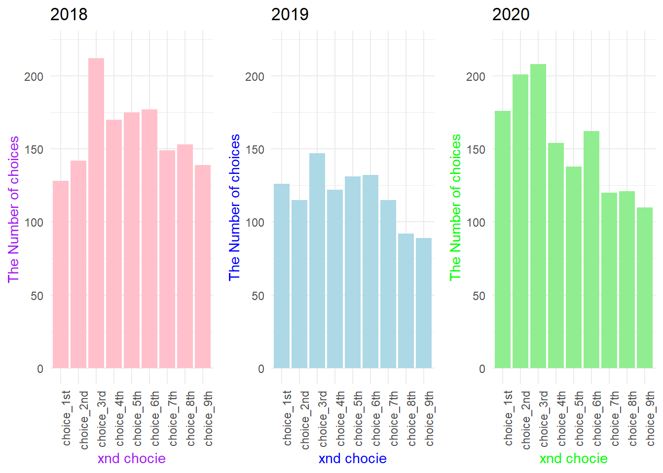
During the analysis phase, the project explores the number of choices and placements for Industrial Engineering departments in Ankara between 2018 and 2020. Detailed visualizations focus on Hacettepe University’s Industrial Engineering choices in 2018, 2019, and 2020, revealing trends in student preferences over the years and providing valuable insights into the university’s attractiveness.
Key findings include the dataset’s potential for future analyses, deeper insights into the educational environment, and the project’s ability to guide prospective students in making informed decisions. The cleaned dataset lays the foundation for a thorough assessment of universities based on student preferences, facilitating a better understanding of university preferences and potential areas for improvement.
PLOT 1
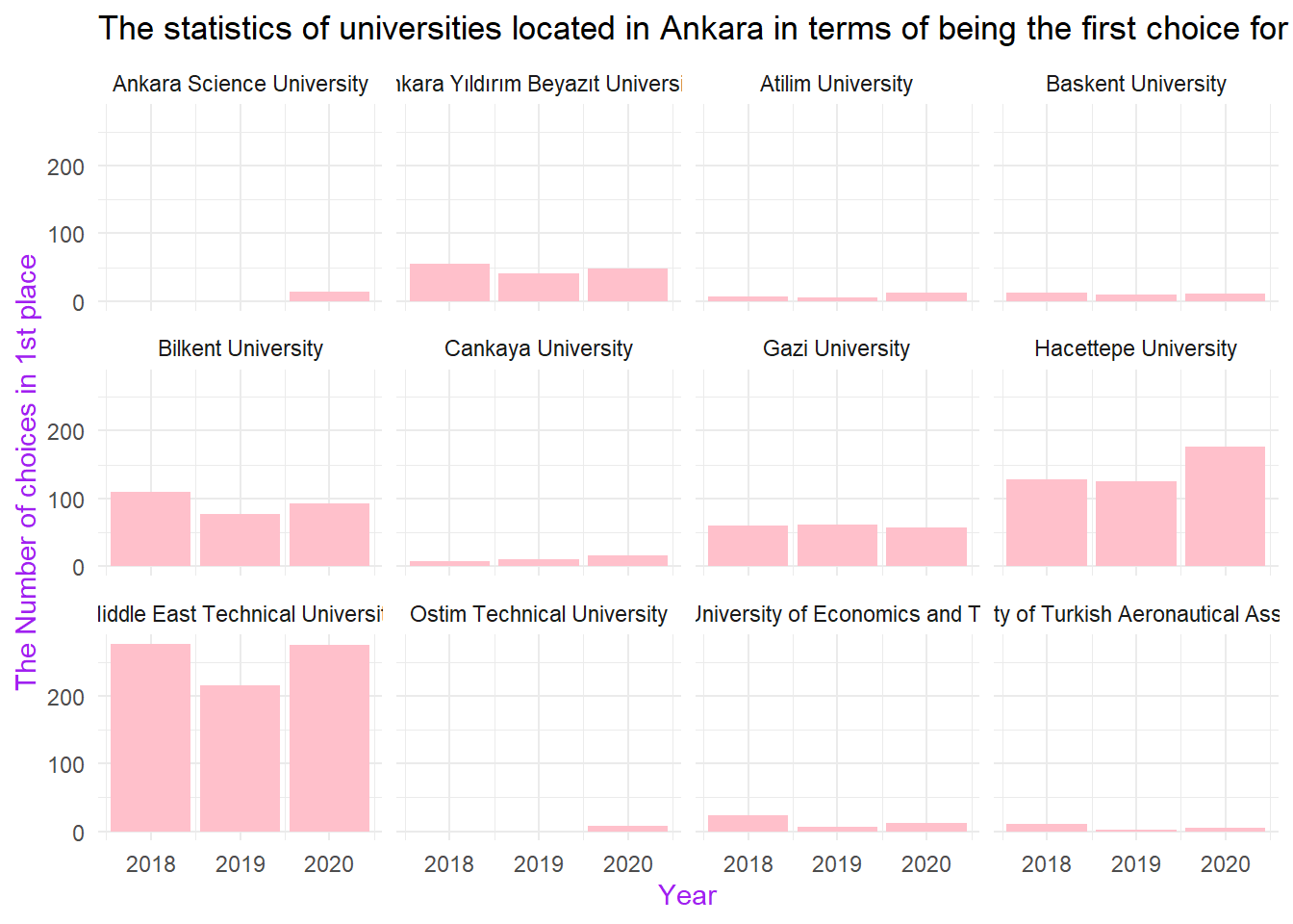
The statistics of universities located in Ankara in terms of being the first choice for students
Show the code
# The statistics of universities located in Ankara in terms of being the first choice for studentsplot_1 <-ggplot(our_data, aes(x = Year, y = choice_1st)) +geom_col(fill="pink")+labs(x ="Year",y ="The Number of choices in 1st place")+ggtitle("The statistics of universities located in Ankara in terms of being the first choice for students") +theme_minimal() +theme(axis.title =element_text(color ="purple"))+facet_wrap(.~ University)print(plot_1)
TABLE : Average of Students’ First Choices Based On Universities
Among the universities in Ankara, we thought that ODTU, Hacettepe, and Bilkent University were most frequently chosen as the first preference, and we have confirmed this by processing our data.
We can say that the first-choice selection for private universities such as Ankara Bilim, Atilim, Cankaya, and Ostim Technical University has increased over the years.We believe that this situation is created by incentives provided by universities, such as internships, to their students.
Additionally, among the State Universities, we observe that only Hacettepe has an increasing trend in being the first choice.
# A tibble: 12 × 2
   University                                      avg_1st_choices
   <chr>                                                     <dbl>
 1 Middle East Technical University                         256.
 2 Hacettepe University                                     143.
 3 Bilkent University                                        93.3
 4 Gazi University                                           59.3
 5 Ankara Yıldırım Beyazıt University                        48
 6 Ankara Science University                                 14
 7 Tobb Etu University of Economics and Technology           14
 8 Cankaya University                                        11.3
 9 Baskent University                                        11
10 Atilim University                                          8.33
11 Ostim Technical University                                 8
12 University of Turkish Aeronautical Association             6.33
Here, when the averages of the choices for ODTU, Hacettepe, and Bilkent are taken, we can comment that these universities are the most preferred ones. Considering the rankings, we believe this table is consistent.
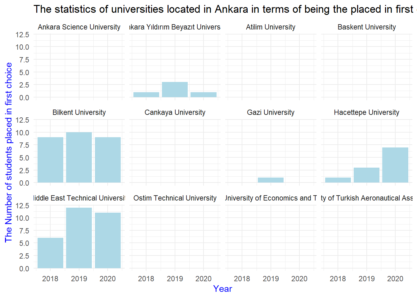
PLOT 2 : The statistics of universities located in Ankara in terms of being the placed in first choice for students
#| code-fold: true#| code-summary: "Show the code"# The statistics of universities located in Ankara in terms of being the placed in 1st choice for studentsplot_2 <-ggplot(our_data, aes(x = Year, y = placed_1st)) +geom_col(fill="lightblue") +labs(x ="Year",y ="The Number of students placed in first choice")+ggtitle("The statistics of universities located in Ankara in terms of being the placed in first choice for students") +theme_minimal() +theme(axis.title =element_text(color ="blue"))+facet_wrap(.~ University)print(plot_2)
This graph shows those who put the relevant university as their first choice and got placed. Here, we observe that none of the private universities showing an increase in the first graph demonstrated value. This tells us that, despite being selected as the first choice, students could not get placed in these universities.
In 2019, the placement situation for those who put these universities as their first choice in Bilkent and ODTC was higher than Hacettepe, while in 2020, we observe a decrease in these numbers. This explains the increase in the number of students placed in Hacettepe in 2020. We think that the students here shifted to Hacettepe.
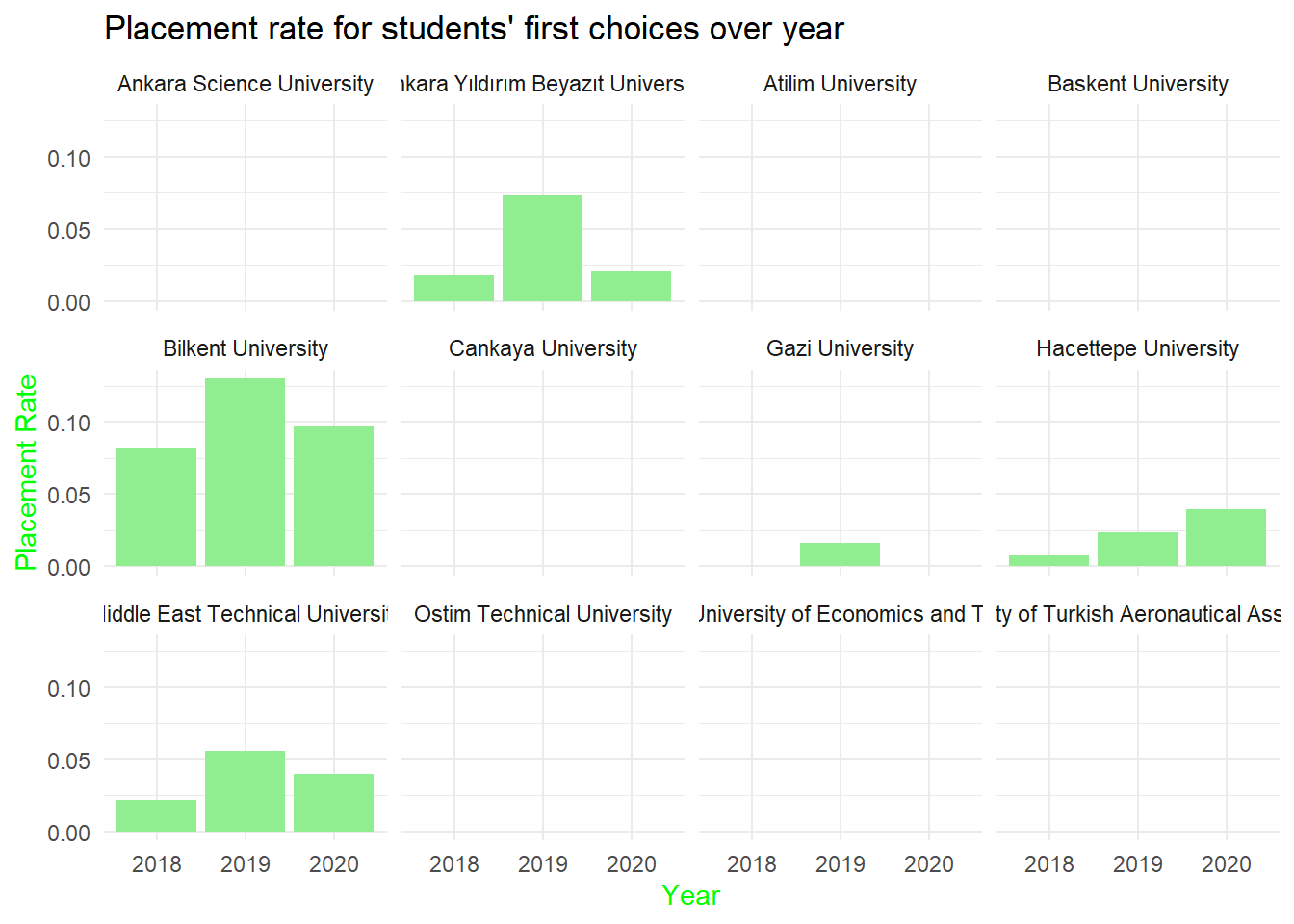
PLOT 3 : Placement Rate for Students’ First Choices
Show the code
# Placement rate for students' first choicesplacment_rate_data <- our_data %>%mutate(placement_rate = placed_1st/choice_1st) %>%select(Year, University, placement_rate)plot_3 <-ggplot(na.omit(placment_rate_data), aes(x =as.factor(Year), y = placement_rate)) +geom_col(fill="lightgreen") +labs(x ="Year",y ="Placement Rate")+ggtitle("Placement rate for students' first choices over year") +theme_minimal() +theme(axis.title =element_text(color ="green"))+facet_wrap(.~ University)print(plot_3)
This graph observes the “writing as the first choice/placement” ratio. Higher-scored universities followed a more consistent path in the preference stage.
PLOT 4 : Based on only Hacettepe University Industrial Engineering data
#| code-fold: true#| code-summary: "Show the code"# Hacettepe University Industrial Engineering data in 2018hacettepe_data1 <- our_data %>%filter(University =="Hacettepe University",Year ==2018)df_long1 <-pivot_longer(hacettepe_data1, cols =starts_with("choice"),names_to ="Choice", values_to ="Value")plot_4 <-ggplot(df_long1, aes(x= Choice, y = Value))+geom_col(fill="pink")+labs(x ="xnd chocie",y ="The Number of choices ")+ggtitle("2018") +theme_minimal() +theme(axis.title =element_text(color ="purple"))+theme(axis.text.x =element_text(angle =90, hjust =1))+ylim(c(0, 220))# Hacettepe University Industrial Engineering data in 2019hacettepe_data2 <- our_data %>%filter(University =="Hacettepe University",Year ==2019)df_long2 <-pivot_longer(hacettepe_data2, cols =starts_with("choice"),names_to ="Choice", values_to ="Value")plot_5 <-ggplot(df_long2, aes(x= Choice, y = Value))+geom_col(fill="lightblue")+labs(x ="xnd chocie",y ="The Number of choices")+ggtitle("2019") +theme_minimal() +theme(axis.title =element_text(color ="blue"))+theme(axis.text.x =element_text(angle =90, hjust =1))+ylim(c(0, 220))# Hacettepe University Industrial Engineering data in 2020hacettepe_data3 <- our_data %>%filter(University =="Hacettepe University",Year ==2020)df_long3 <-pivot_longer(hacettepe_data3, cols =starts_with("choice"),names_to ="Choice", values_to ="Value")plot_6 <-ggplot(df_long3, aes(x= Choice, y = Value)) +geom_col(fill="lightgreen")+labs(x ="xnd chocie",y ="The Number of choices")+ggtitle("2020") +theme_minimal() +theme(axis.title =element_text(color ="green"))+theme(axis.text.x =element_text(angle =90, hjust =1))+ylim(c(0, 220))print(grid.arrange (plot_4, plot_5, plot_6, ncol =3))
TableGrob (1 x 3) "arrange": 3 grobs
  z     cells    name           grob
1 1 (1-1,1-1) arrange gtable[layout]
2 2 (1-1,2-2) arrange gtable[layout]
3 3 (1-1,3-3) arrange gtable[layout]
This graph shows in which ranking Hacettepe was chosen within 3 years. We can say that this graph supports our other graphs. We see that the highest value is in the 3rd preference column. Similarly, we observe that the first-choice selection situation increases over the years.